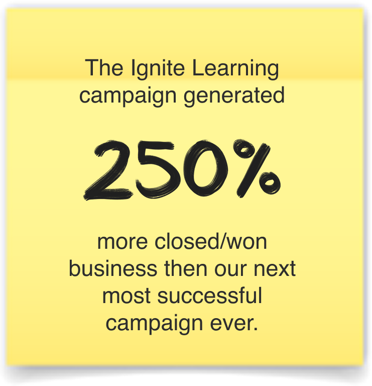
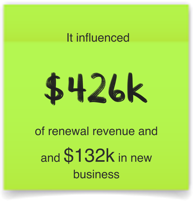
Back-to-School (BTS) is one of the most revenue-critical moments of the year for any EdTech company. For the 2025 campaign, I brought all creative production in-house—saving the company over $200K compared to the prior year while delivering stronger engagement and conversion metrics. By leveraging our team’s deep understanding of educators and classrooms, we created a campaign that felt authentic and outcome-driven—highlighting how Discovery Education’s K–12 products build real-world skills and career readiness. The result was a more resonant brand message, measurable growth in lead quality, and a major win for internal creative capability.
For this campaign, I led the Marketing Design Team of designers Valerya Calleros and Laura Belge.
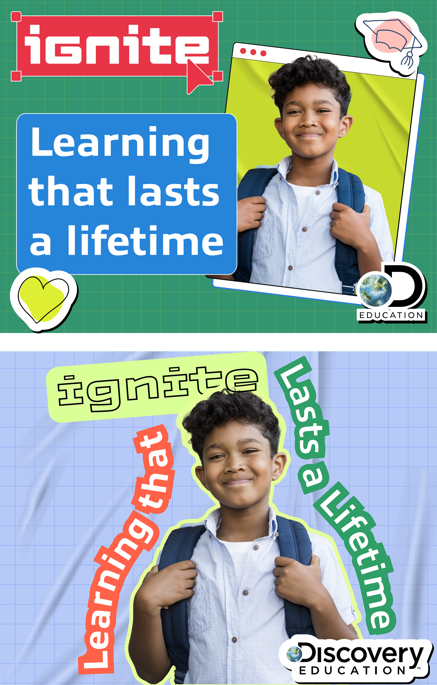
BTS Marketing Campaign
Visual Branding | UX | Campaigns | Print & Digital | Illustration
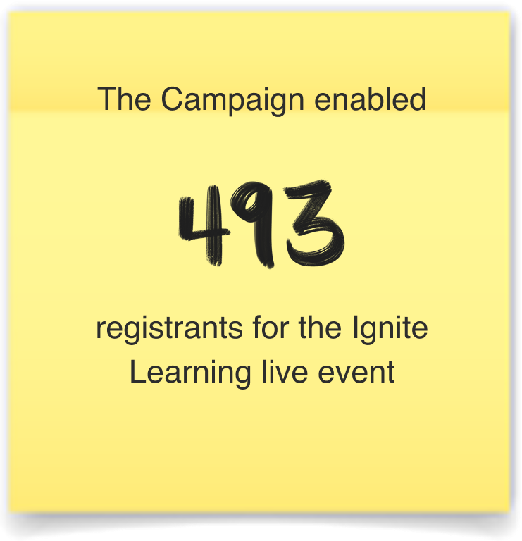
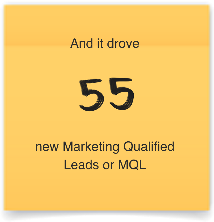
Quick Stats of Engagement

Paid Media

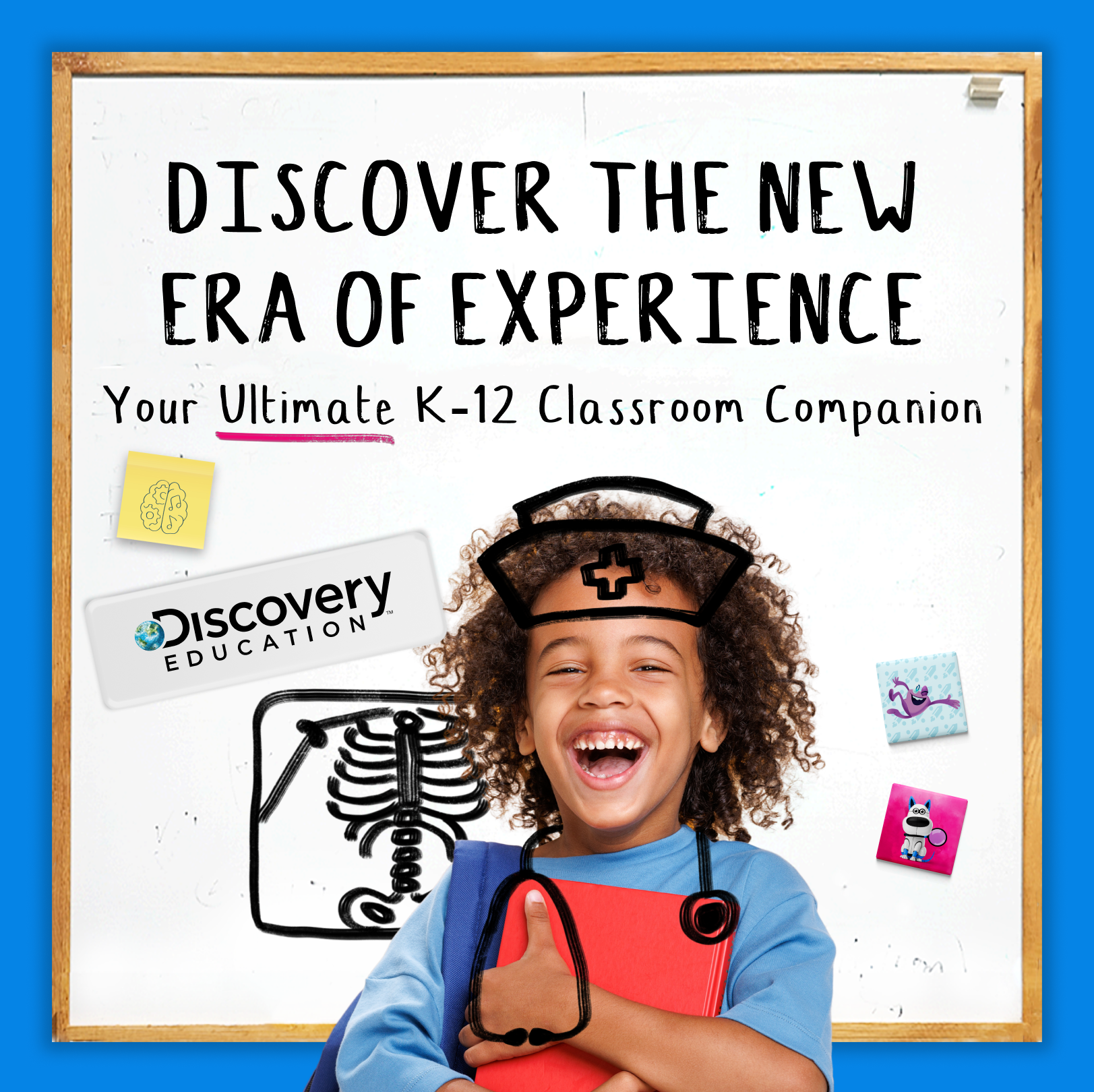
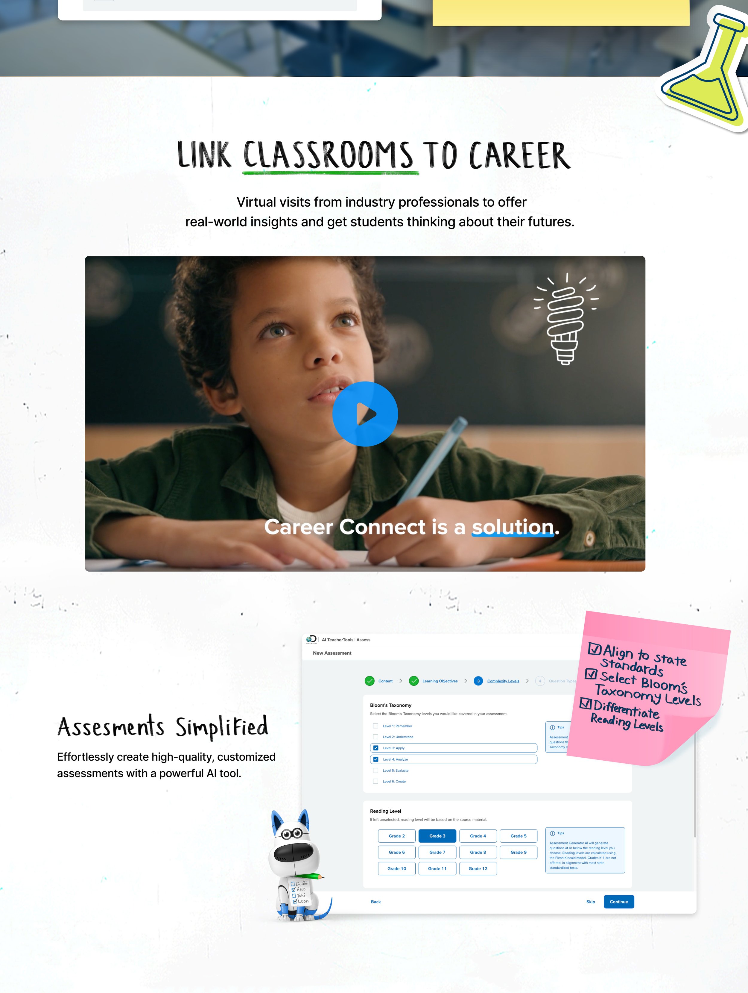
Above is a social ad that ran throughout the Back-to-School season. Designed as a vertical scroll experience, it follows the journey of a young student whose early curiosity in science grows into a passion for healthcare—ultimately leading him to pursue a degree in nursing. This type of human connection worked well.

Paid Media with fewer words and more impactful copy outperformed ads with no students and too much to read.
What Worked and What Did Not

This media performed poorly compared to the one on the left, and we quickly adjusted course.
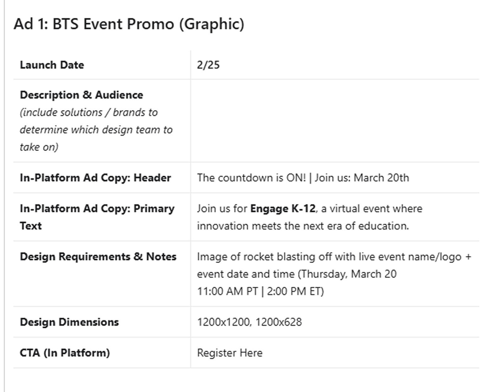
Events
Above is the K-12 brief for the event promo next to the designed paid media for the event, and below is the video showcasing all new programs and product features Discovery Education was launching for Back to School 2025.

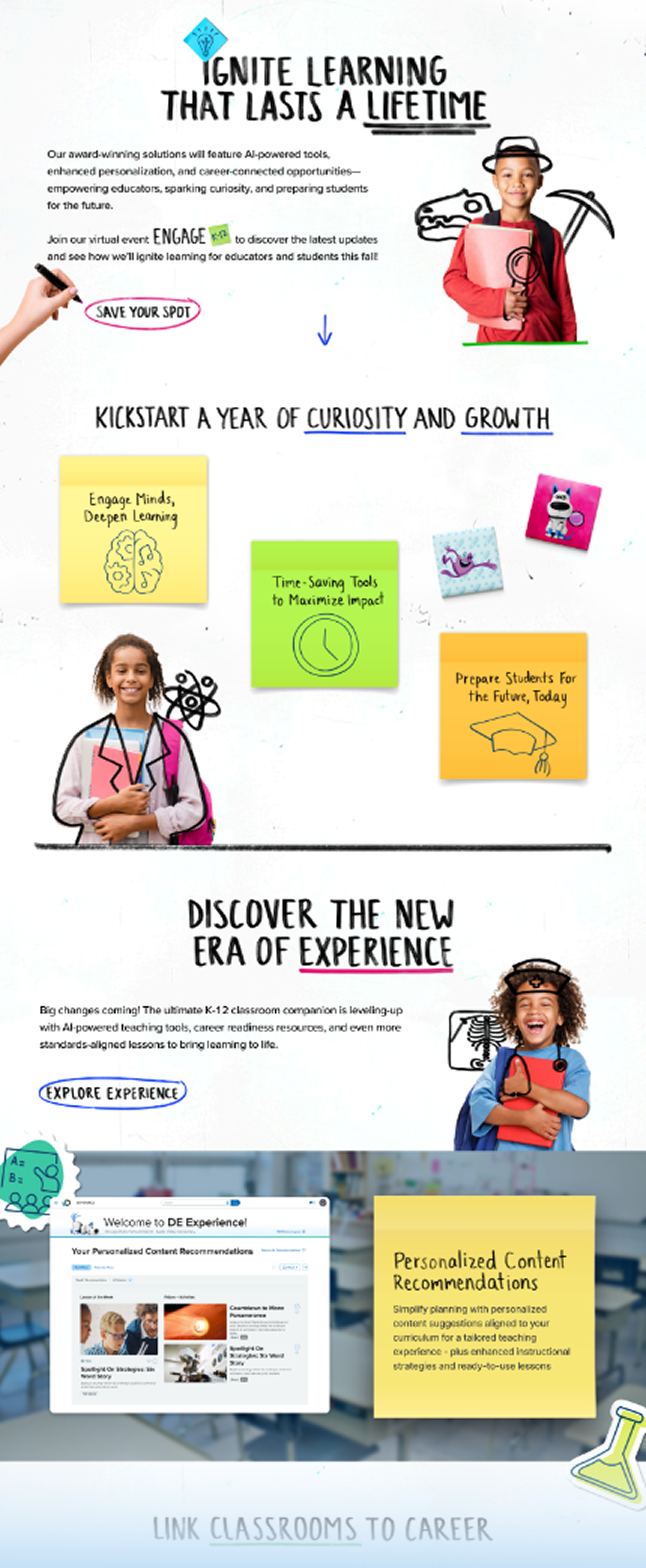
Back to School Landing Page
As we concepted a microsite for our customers to get to know everything new for Back to School, I encouraged our Marketing Strategists to work in whatever format helped them express their ideas best. They came up with these very helpful rough wireframes which we could then apply UX best practices and the BTS campaign style guides to:
Rough Wireframes

Below is the final landing page which links to loads of resources and contains all of the BTS messaging alongside videos and screenshots of the products.
Final Design
Below are some of my favorite moments from the BTS microsite where we folded the Product Branding of each offering into the style guides for the BTS campaign design. This is always a delicate balance. This was the first year we had one director managing both Product and Global Branding as I had been moved into a position to oversee and direct both teams.

Design Process
When I took ownership of the Global Marketing Team and met with each department leader one-on-one, I heard consistent feedback: creative output lacked iteration, volume, and polish. Stakeholders wanted to see multiple creative directions before committing to a campaign, and the overall quality needed to be elevated. To address this, I implemented the same structured design process I had successfully established within the Product Development teams—bringing greater rigor, exploration, and creative excellence to Marketing’s workflow. The result was a noticeable lift in creative quality, faster stakeholder alignment, and more effective campaigns across global markets.
Research
I asked the designers to spend some time doing the pre-work of researching design trends within EdTech, but also in other industries like gaming and retail. Here are three mood boards they put together to present three very different vibes to the Marketing Leadership including the EVP of Marketing.


Quick Snapshot Concepts
I had the team produce quick concepts of what a piece of paid media would look like for each vibe.
Concept 1
Concept 2
Selecting and Refining
While Concepts 1 and 2 were certainly full of the energy and fun of the classroom, Concept 3 was the clear winner with all stakeholders.
Next we refined the concept further by replace the blackboard and chalk with the more contemporary whiteboard and marker.

We have a Winner!
I knew we had a winning concept. It tied everything together in an extremely emotional way that would resonate with parents, teachers and administrators. It spoke to what all educators live for- helping a student find their calling. It was simple and powerful.
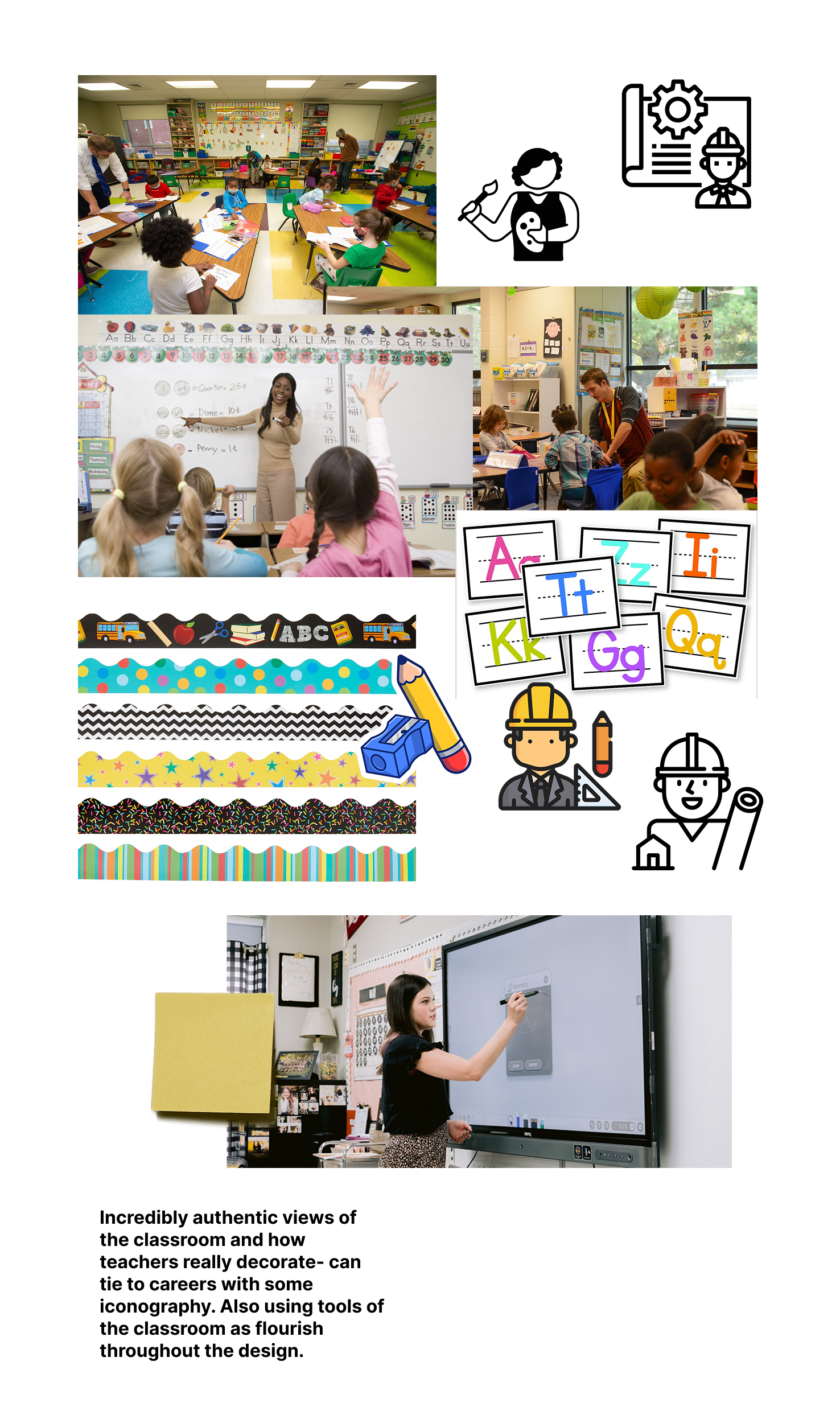
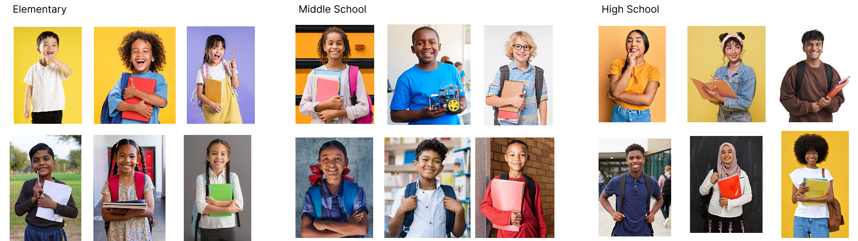
Next steps were to source photography for all three gradebands of K-2, 3-5 and 6-8 and then create similar drawings of the professions.
Concept 3


Vibe 1
Vibe 2
Vibe 3
Style Guides and Production
In such a large organization as Discovery Education it’s vital to produce and dispurse easy to use style guides and templates for anyone at the company to pick up. This work was very exciting and new. Everyone wanted to use it for everything! I had to ensure that we were applying the design correctly and on the right materials, but also make that very open source so everyone from engineering to sales could pick it up for everything from a Zoom background to an in-person sales event. We used Canva libraries and templates in addition to the more traditional design tools to make this available to all employees.

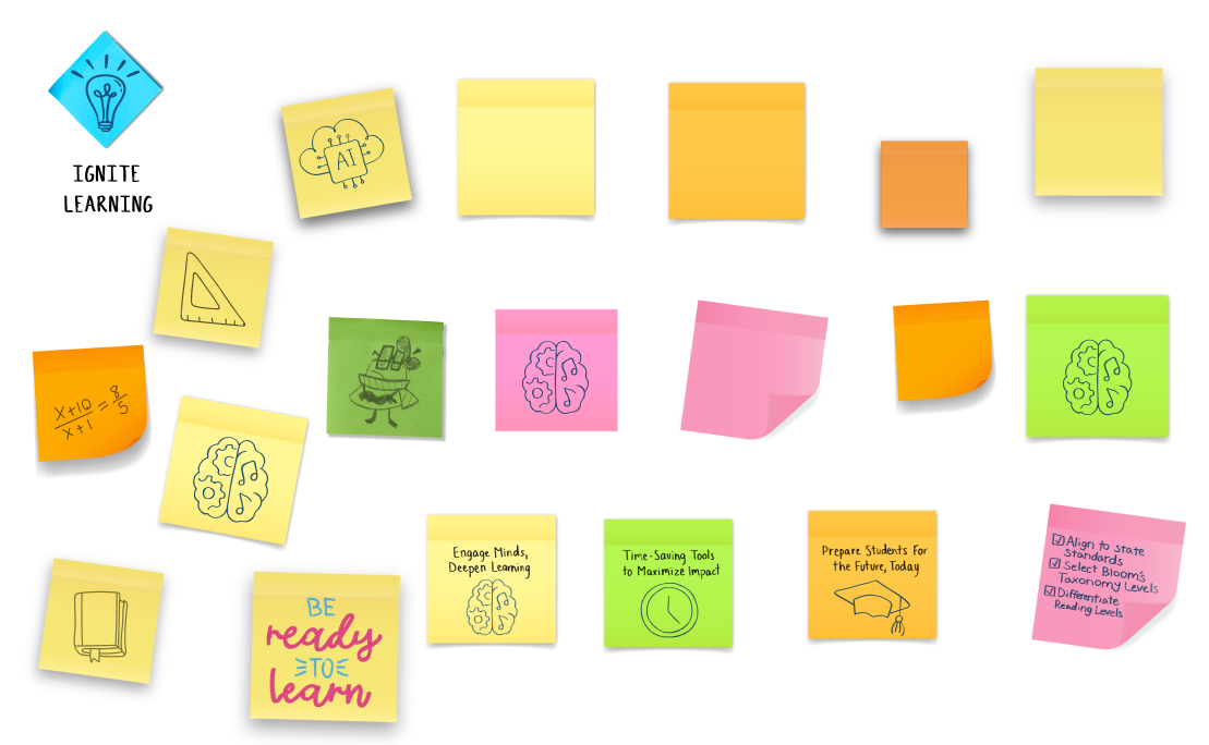
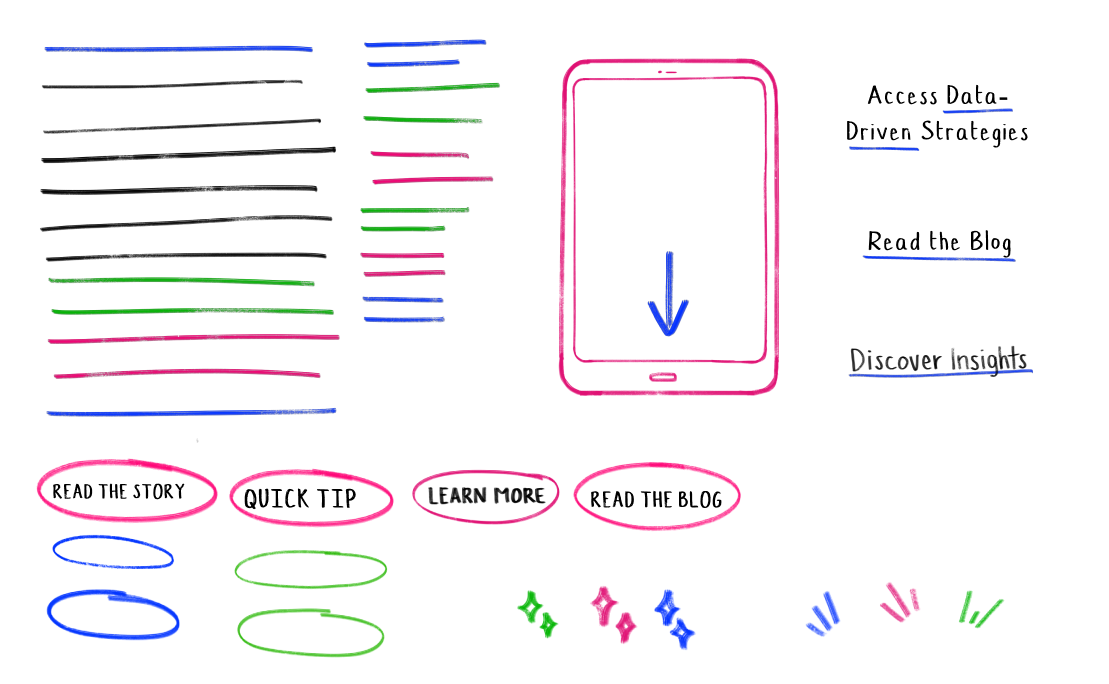
Assets for Everyone
The team created many hand drawn and photographic assets at varying aspect ratios for the teams to be able to DIY emails, web pages, paid media, videos and more.
This saved our company time and money with a DIY spirit and allowed sales to act quickly.
New Ways of Working
I encouraged the designers to download Procreate and just give it a try. I knew we wanted to have an authentic classroom feel, and no font felt right.
Designer Valerya Calleros surprised us all by turning her own hand writing into this beautiful font. With a desktop and web font, we enabled our partners to update copy quickly to react to metrics making campaigns work better for everyone.