Kate Farms Brand Research
A few links of my relevant work:
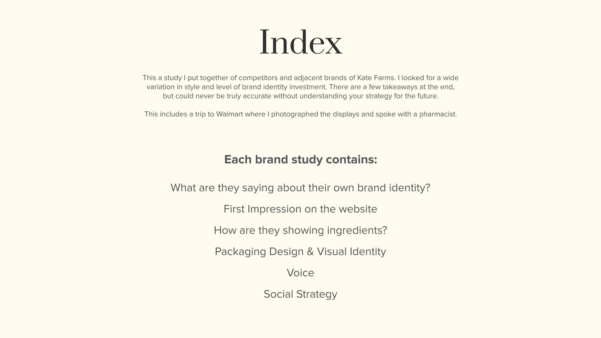
Hi! While I was learning about Kate Farms I wanted to study the branding and marketing of other products, so I have put together a little research into some adjacent brands. Some are close to Kate Farms, and some are not. I chose a variety of levels of investment in the branding in order to see what works for each.
With the new Walmart deal and the acquisition by Danone, this is a very interesting time for you to form a brand team. I’d love to be a part of that.
After doing this research I definitely have thoughts of some cool things we could do with Kate Farms, but very subjective as to where you are thinking to take the brand under your direction.
Thank you for taking a look!
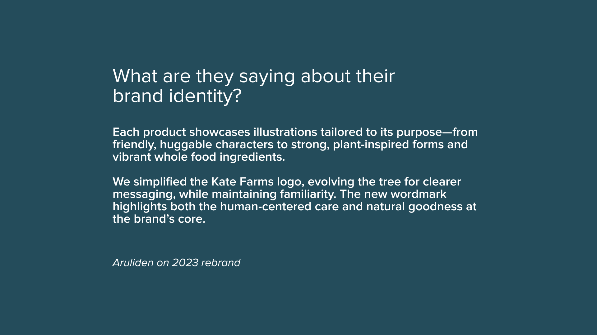
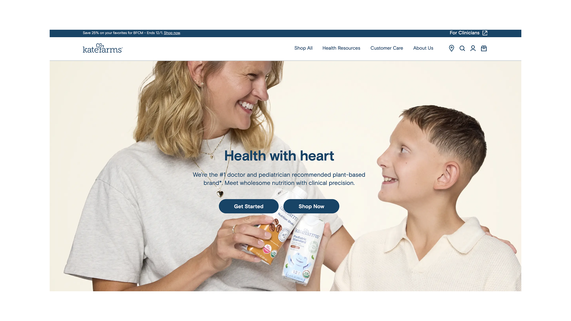
Kate Farms
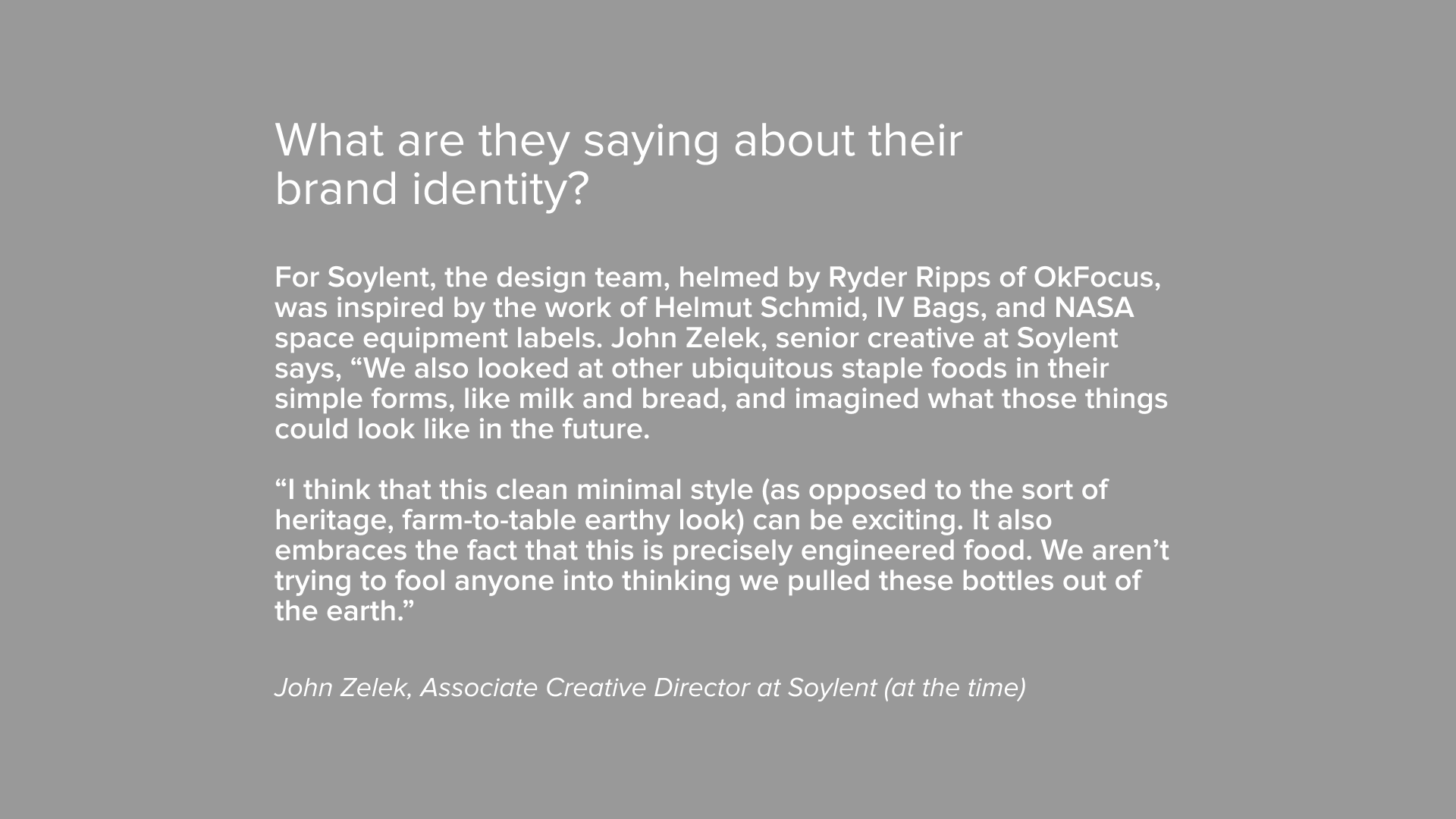
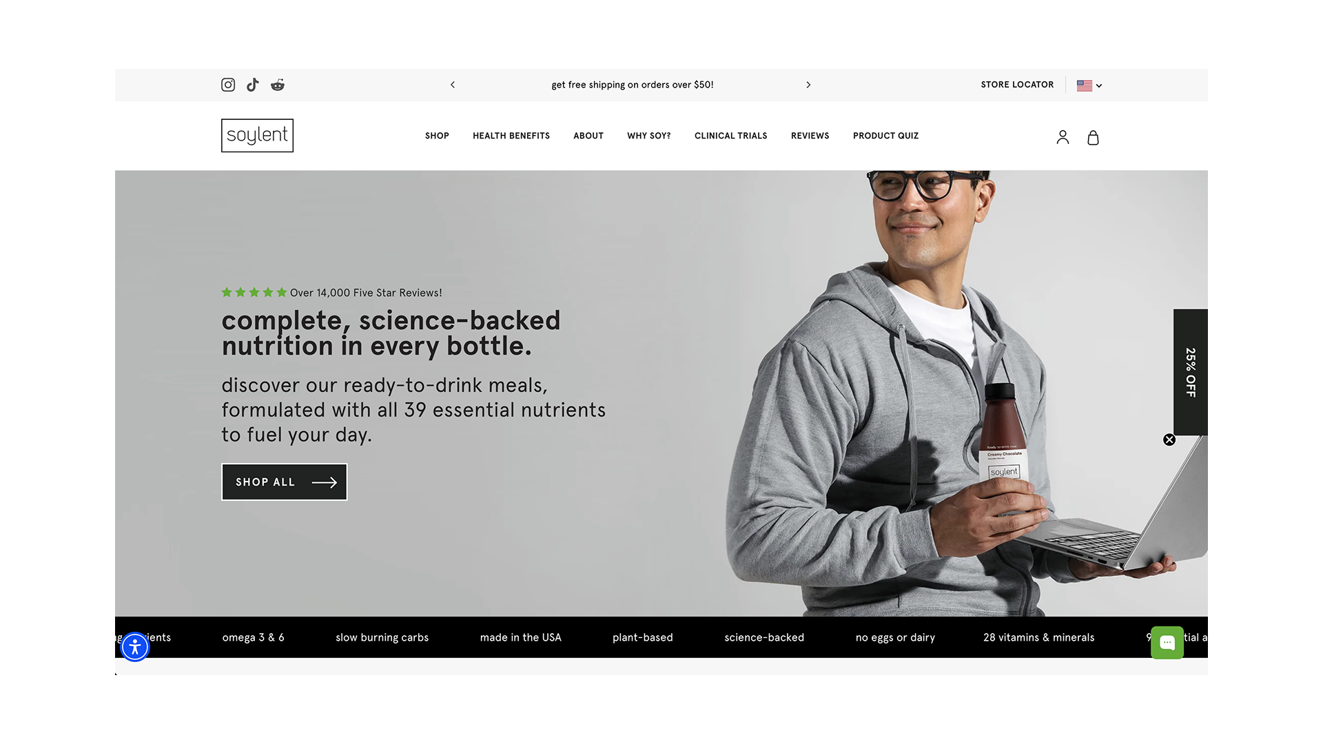
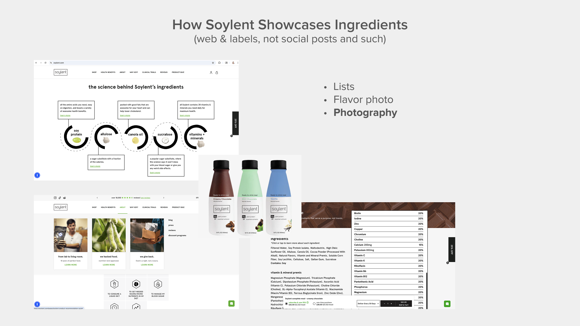
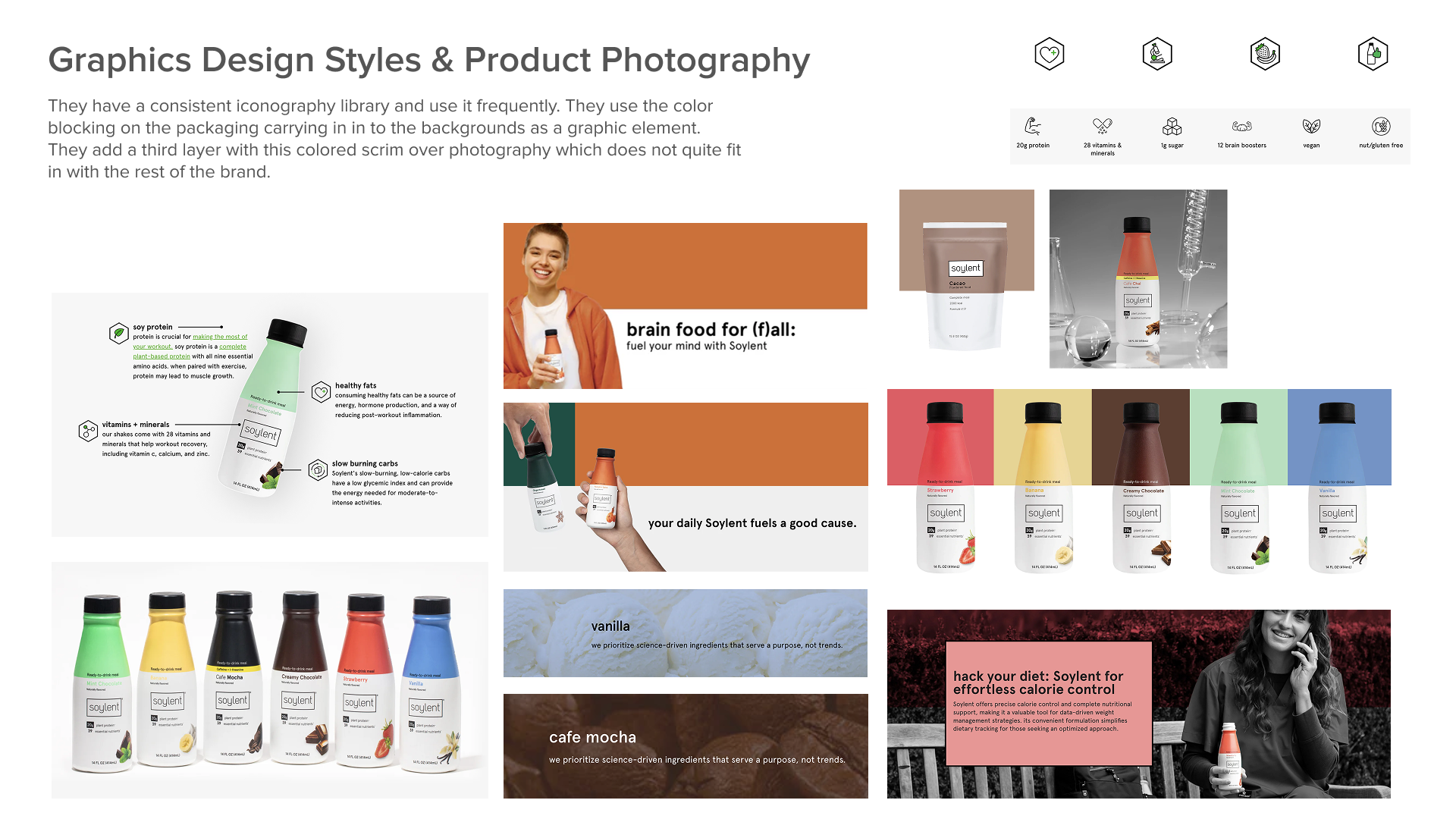
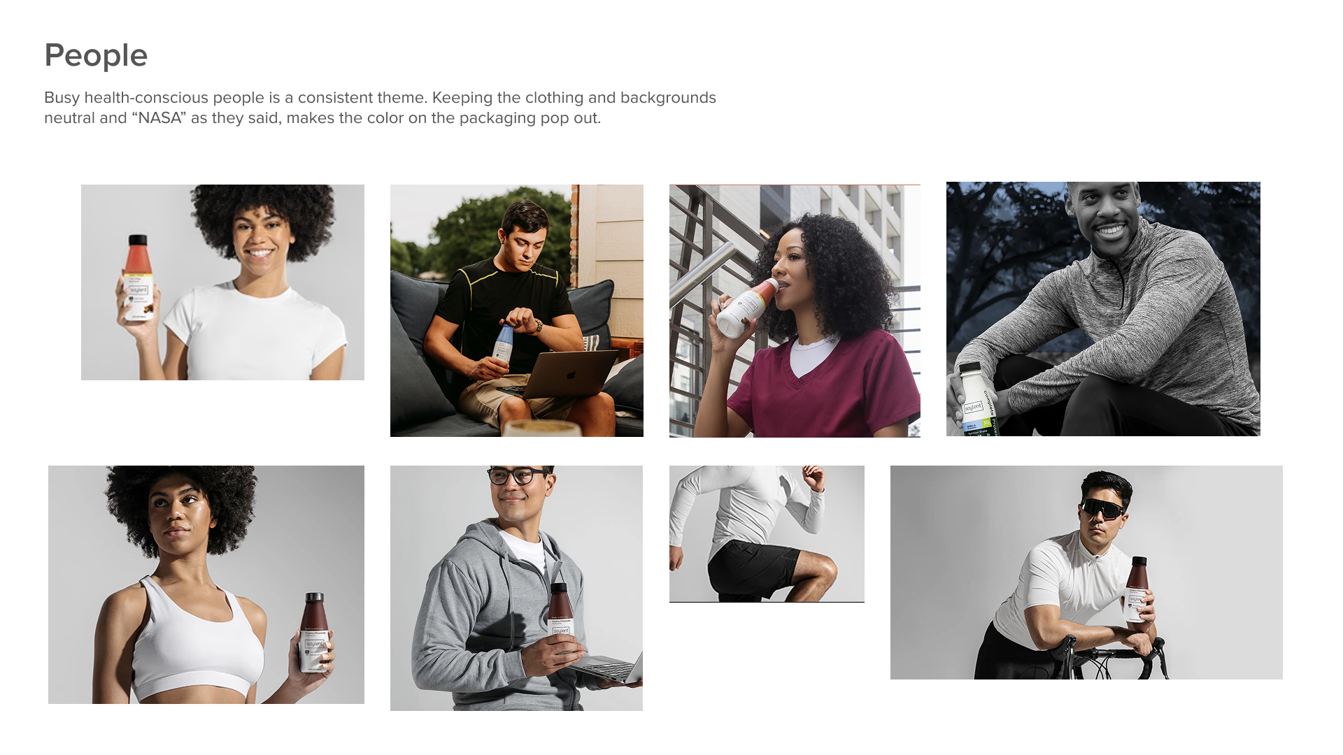
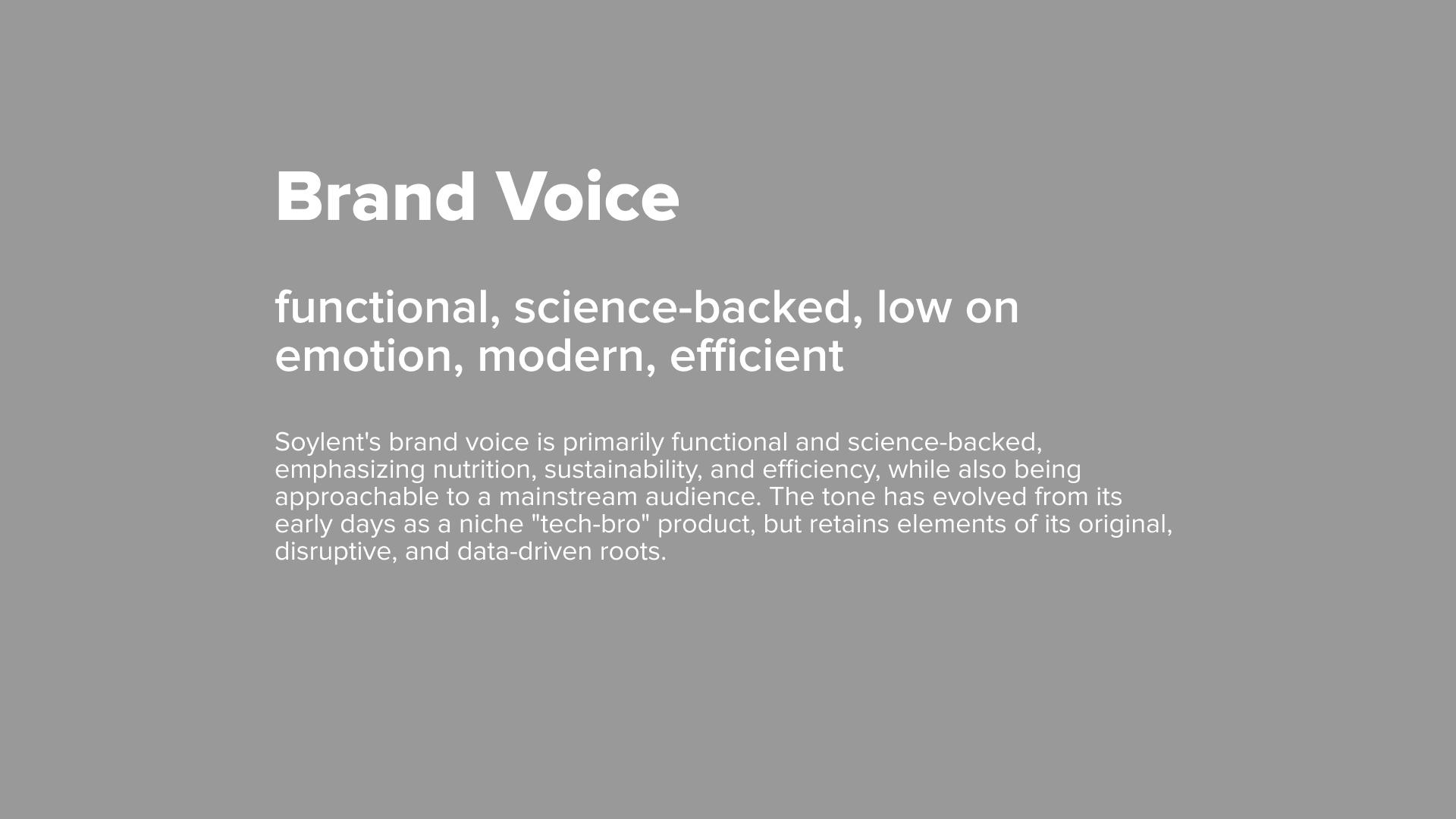
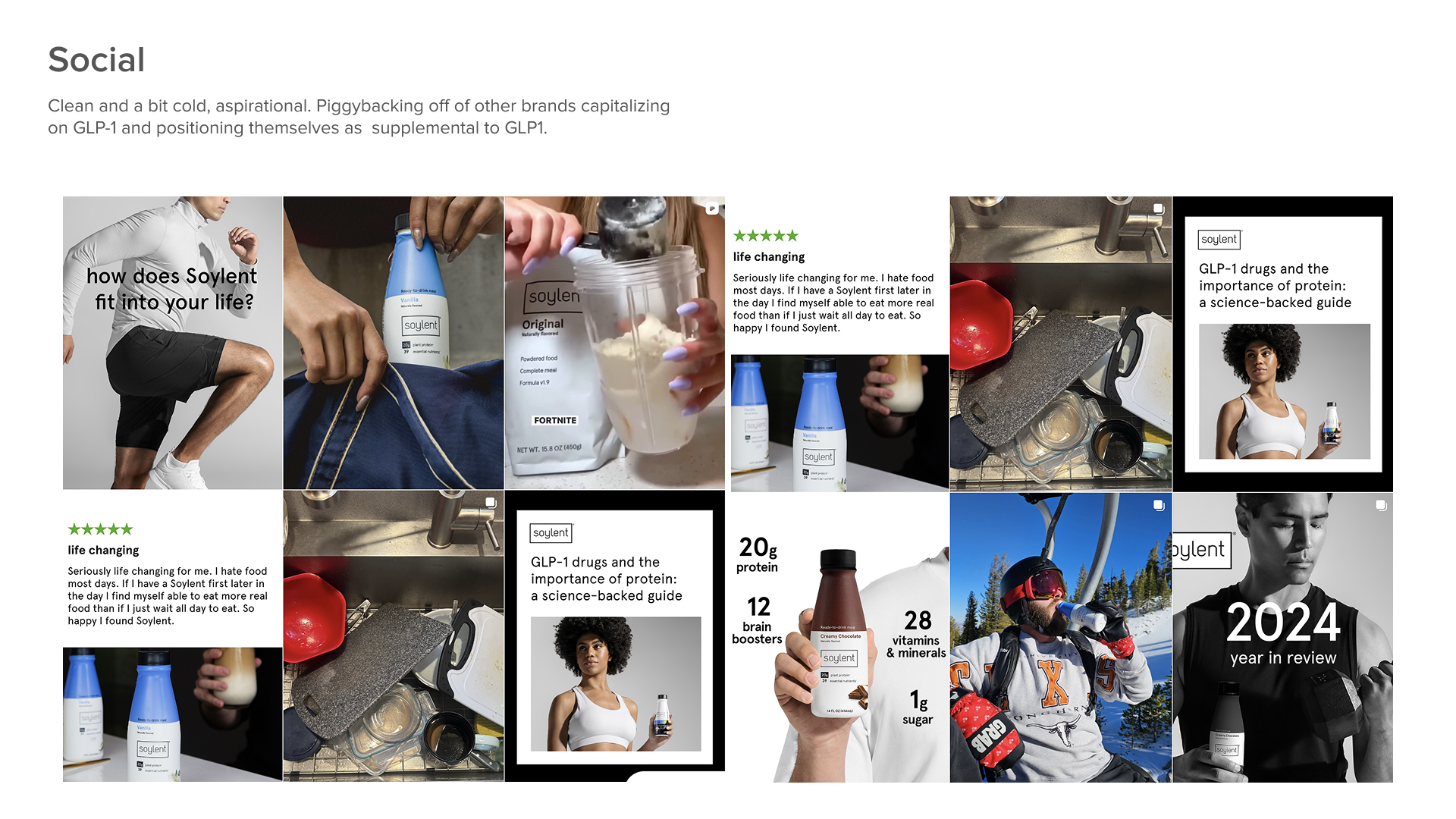
Soylent
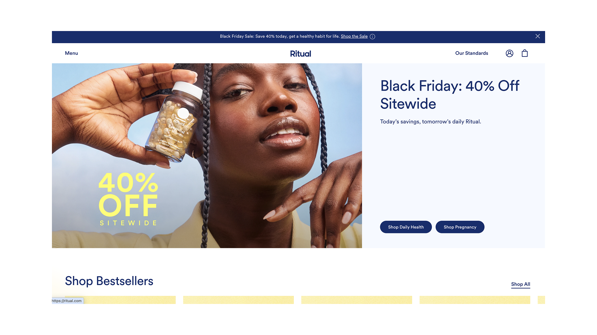
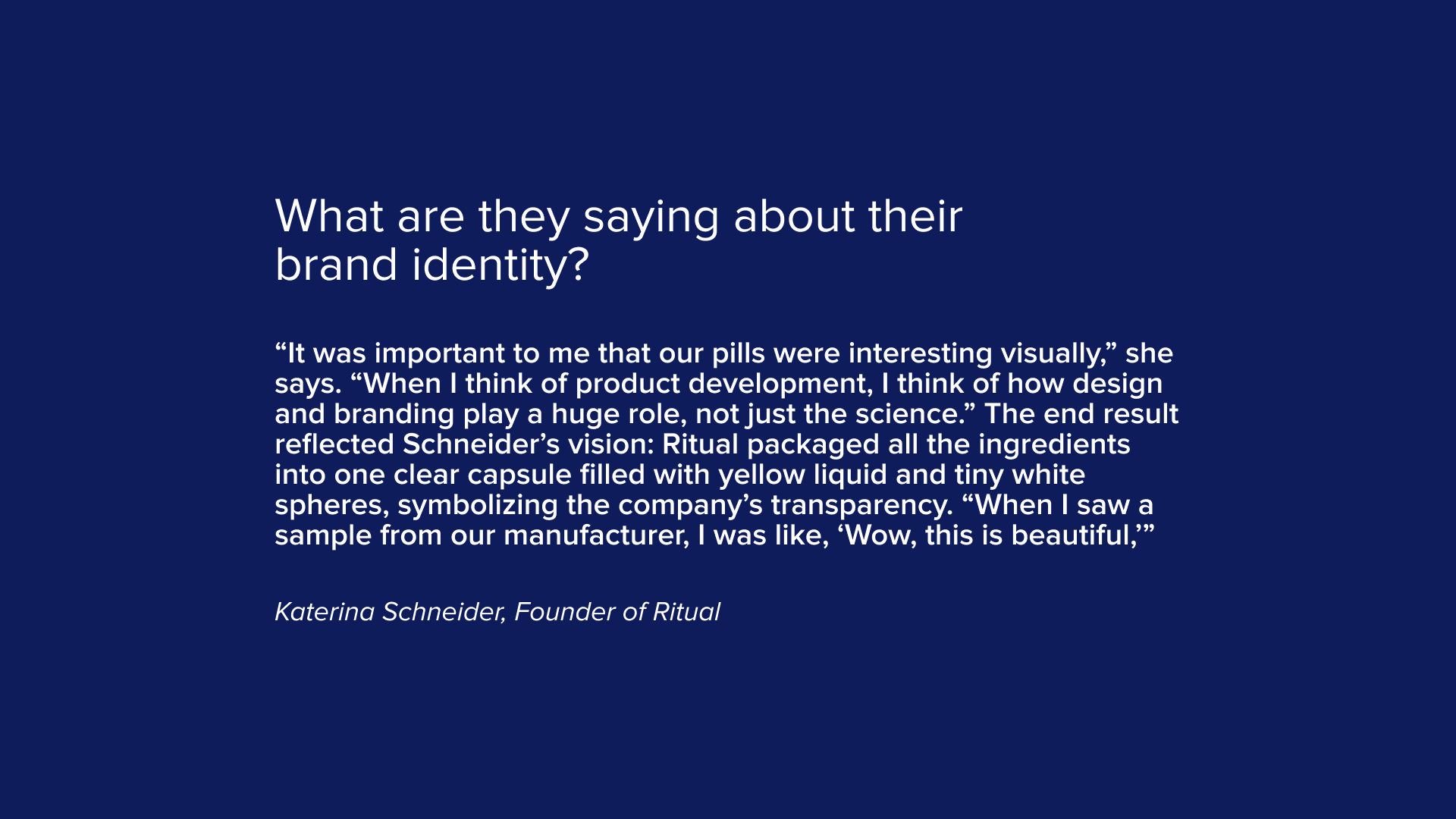
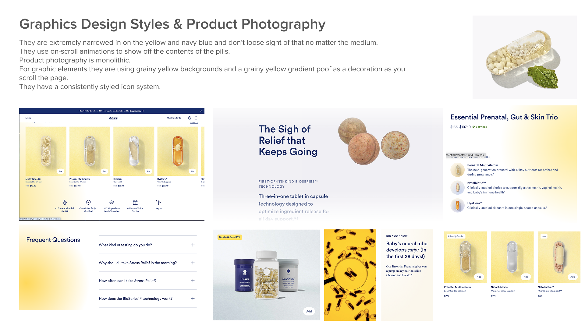
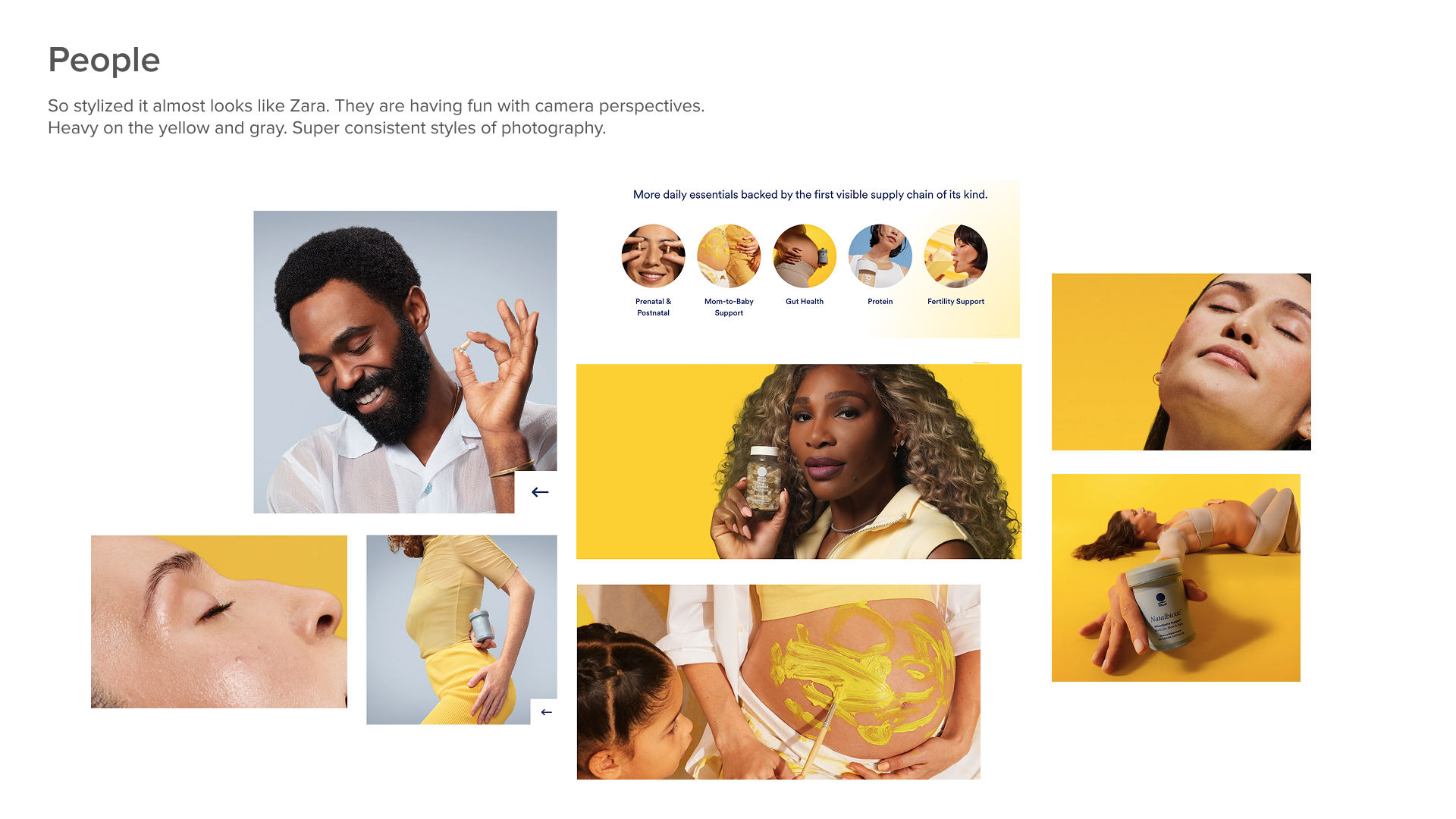
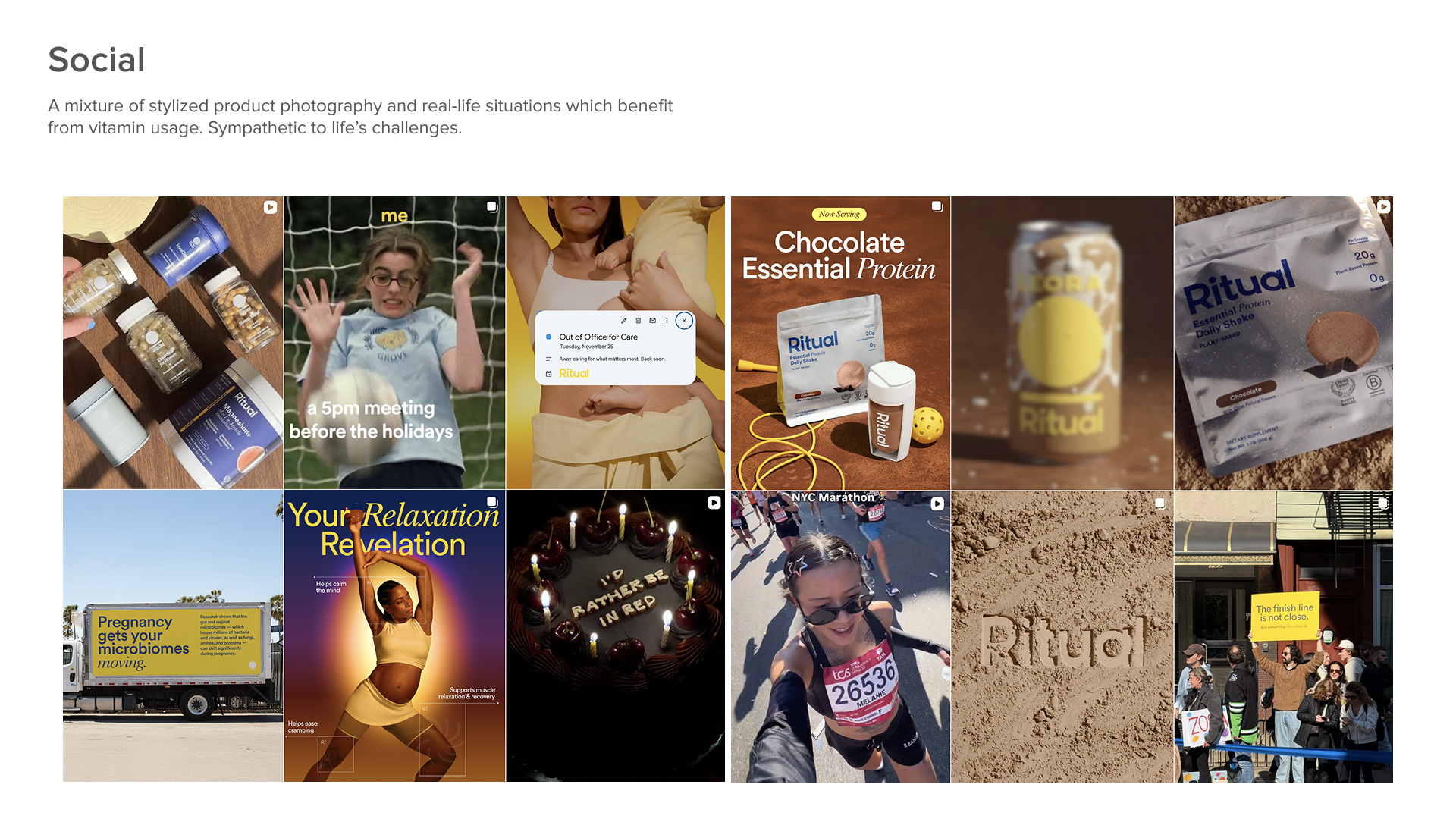
Ritual
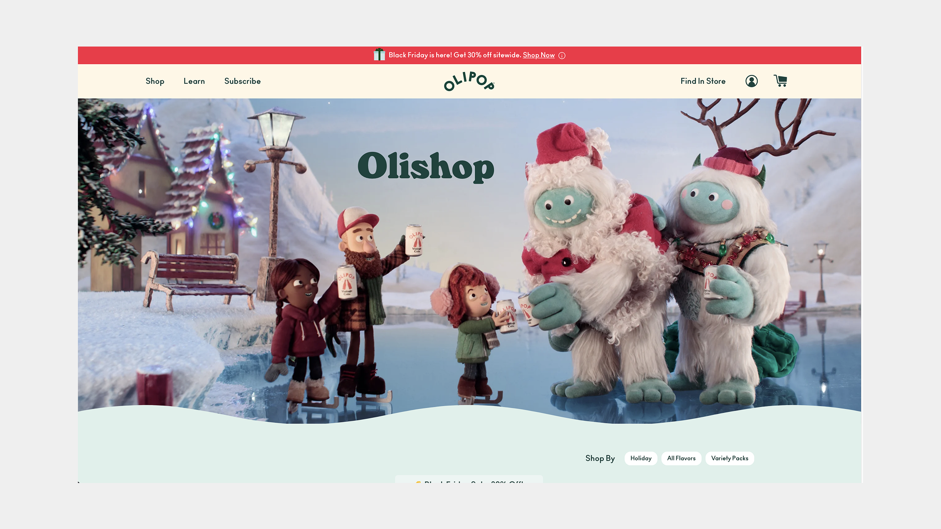
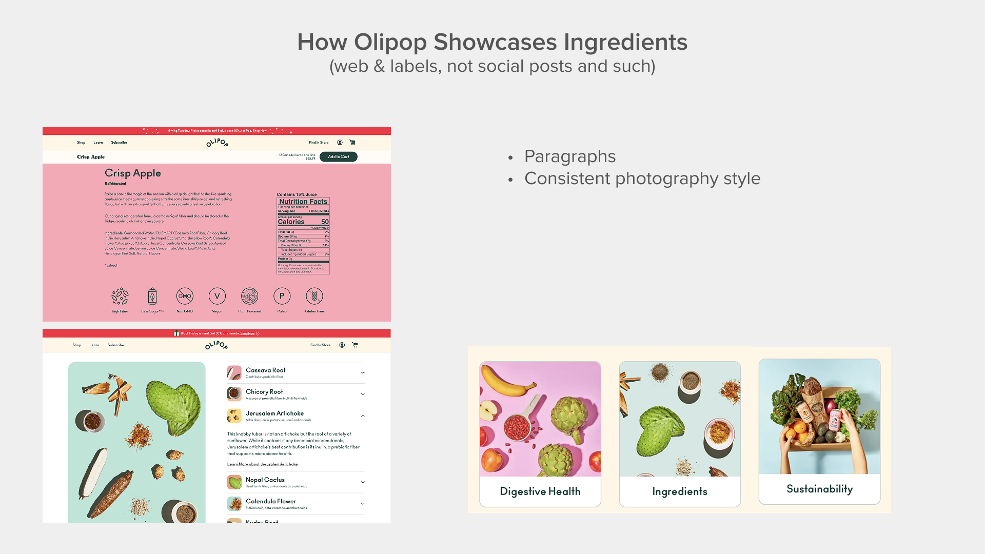
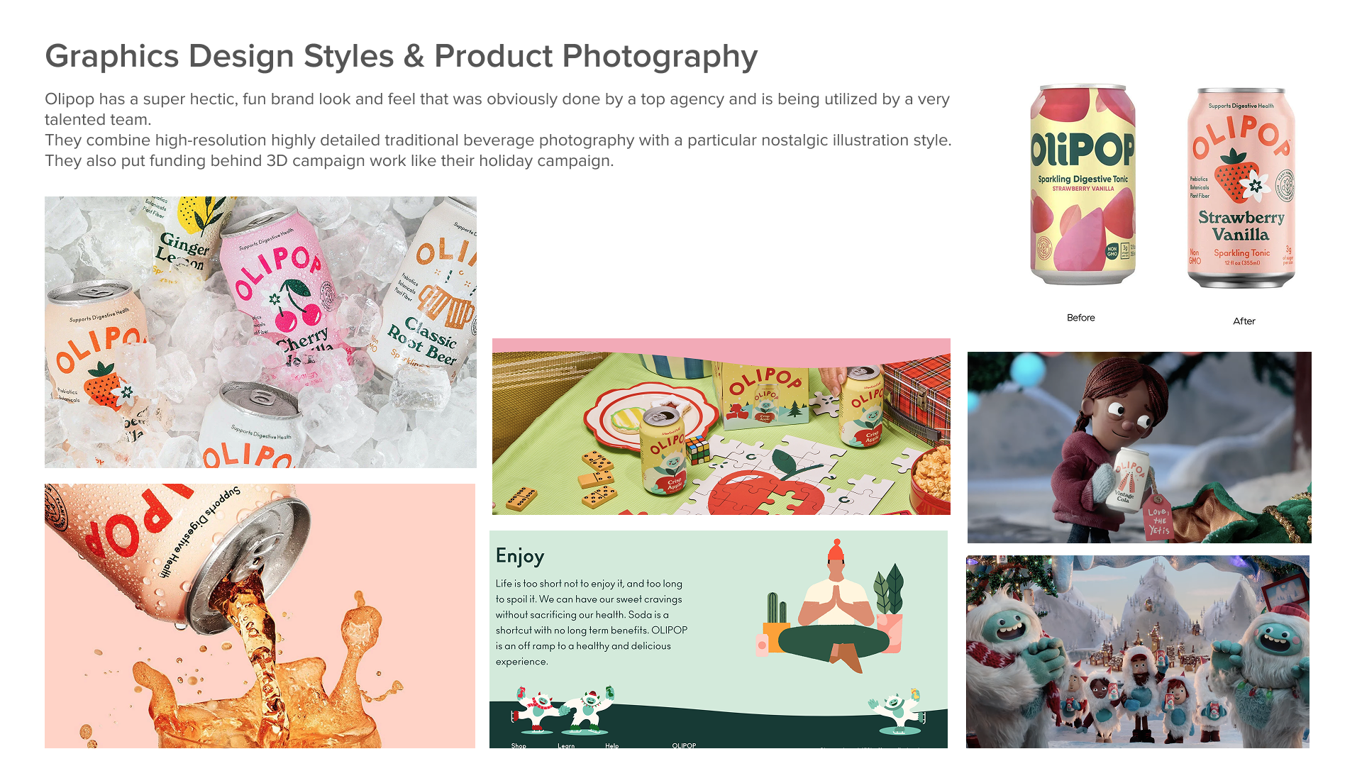
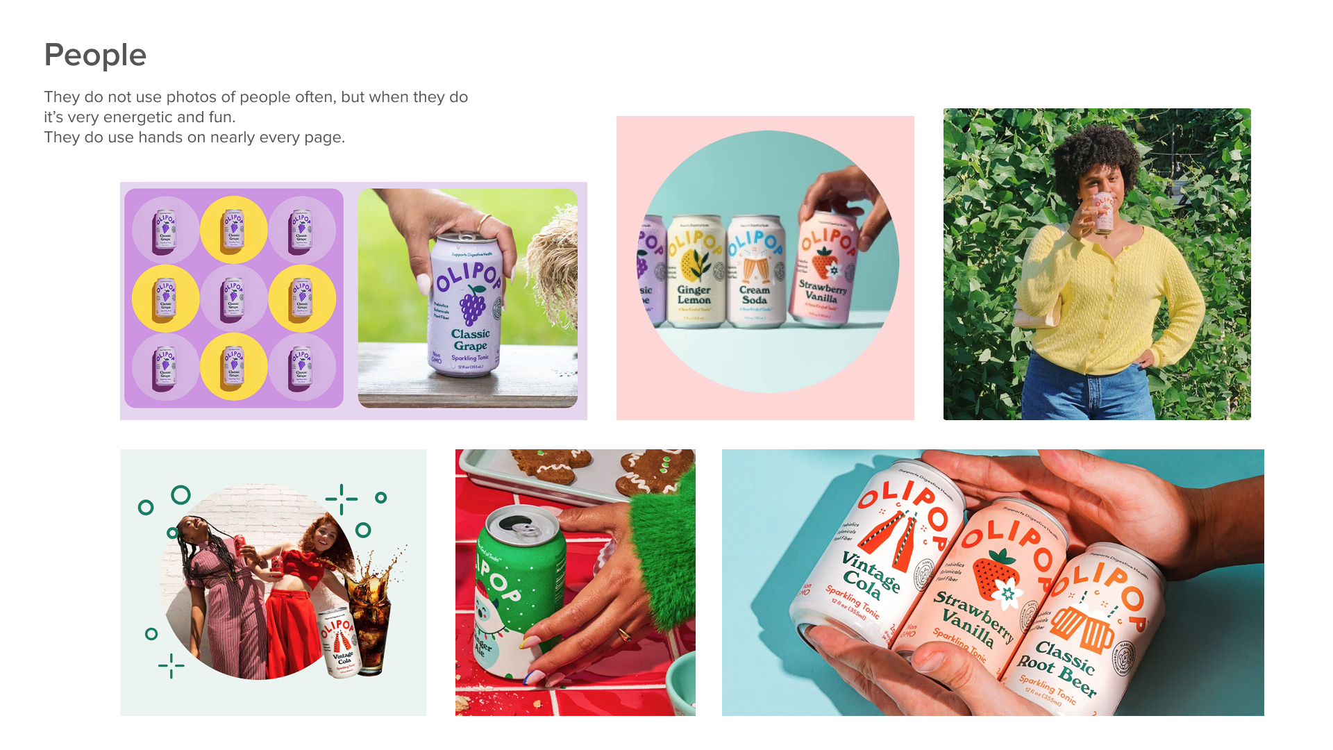
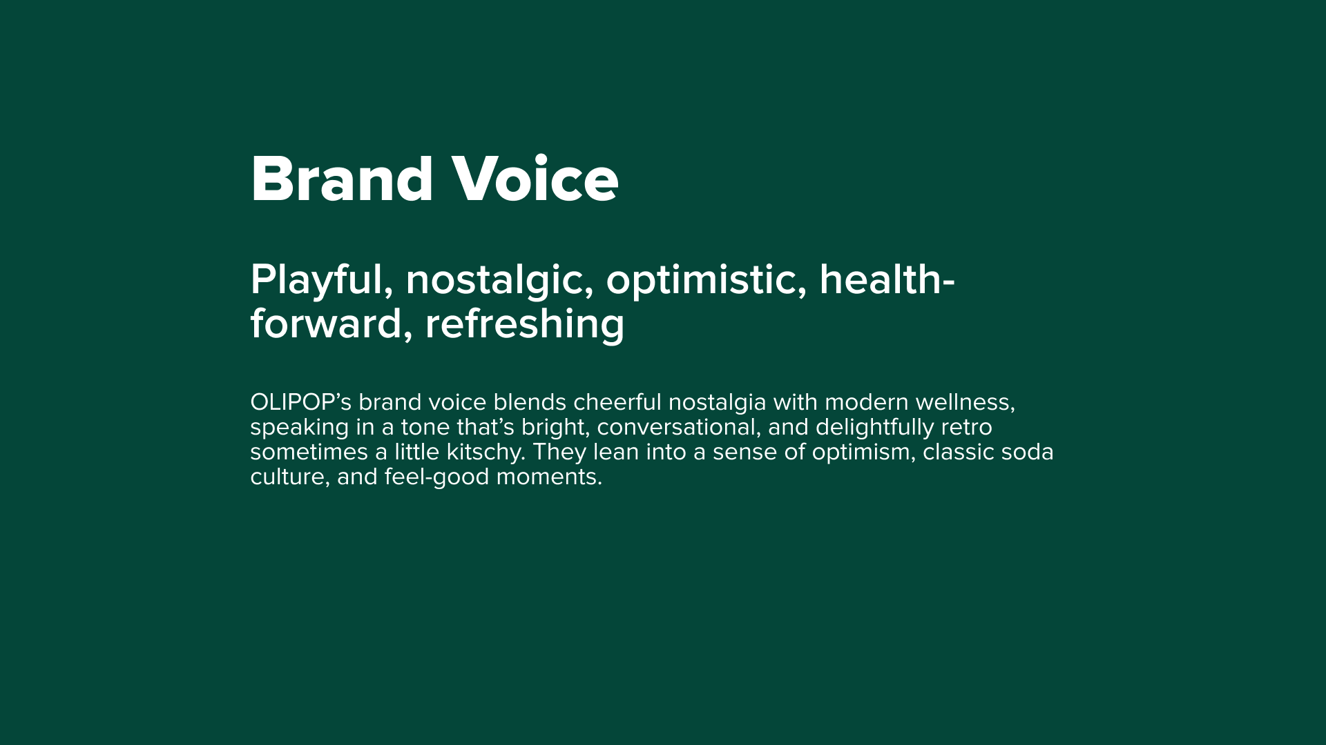
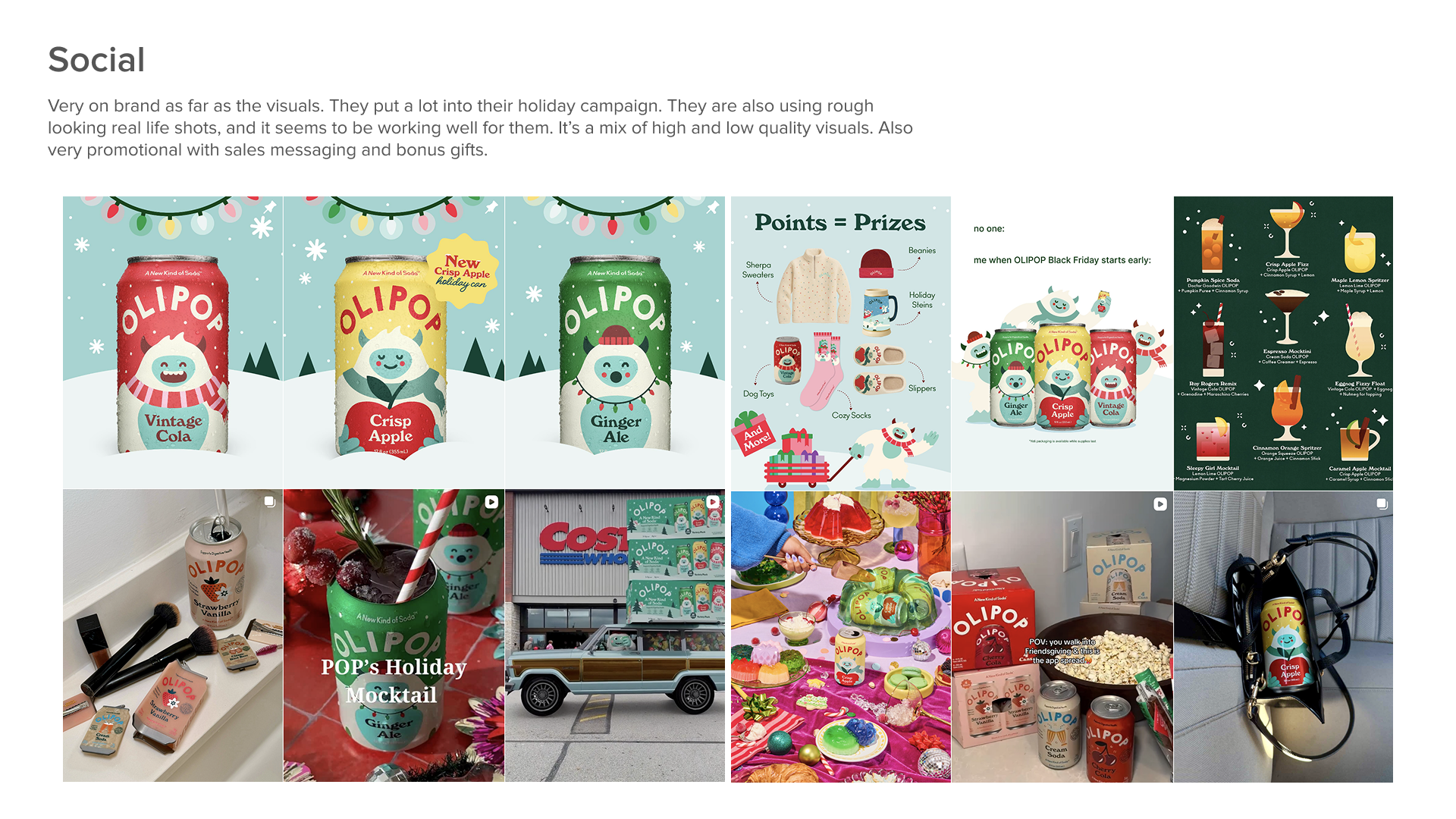
Olipop
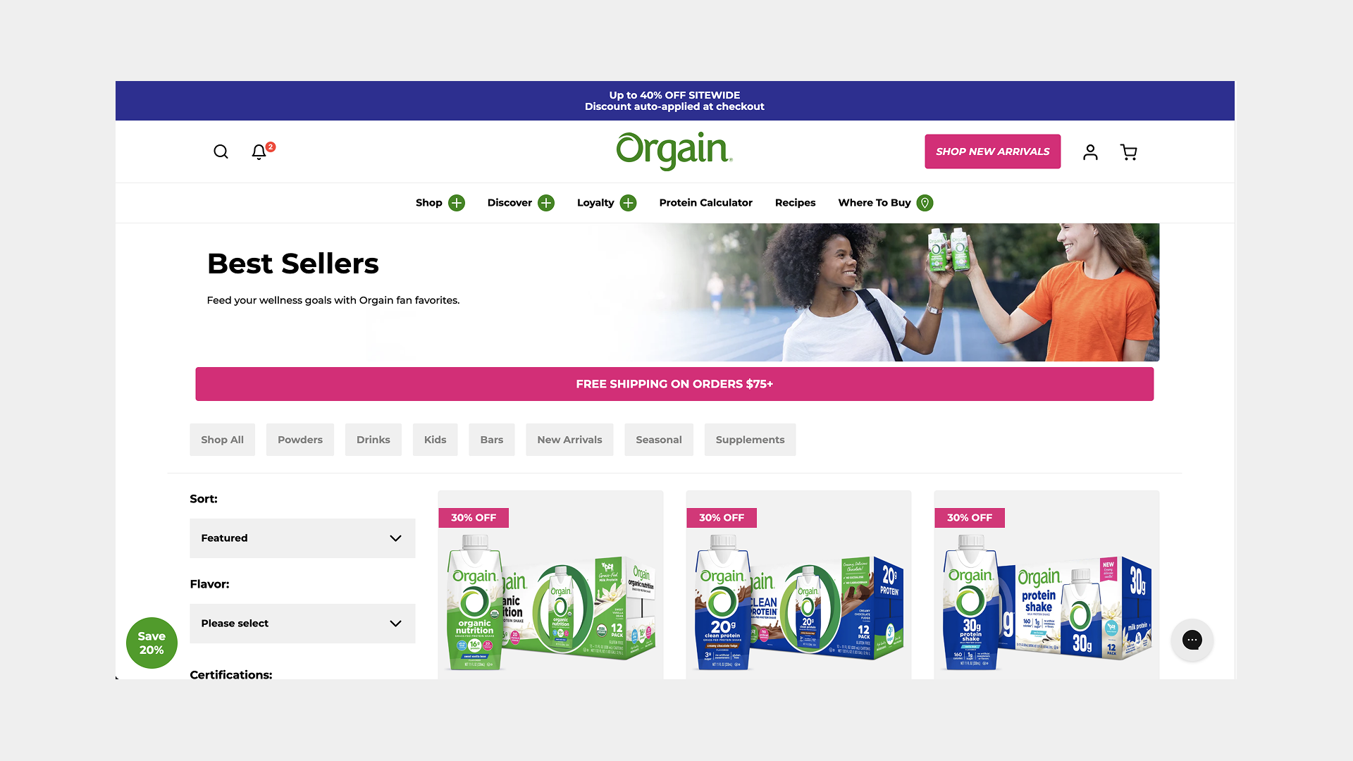
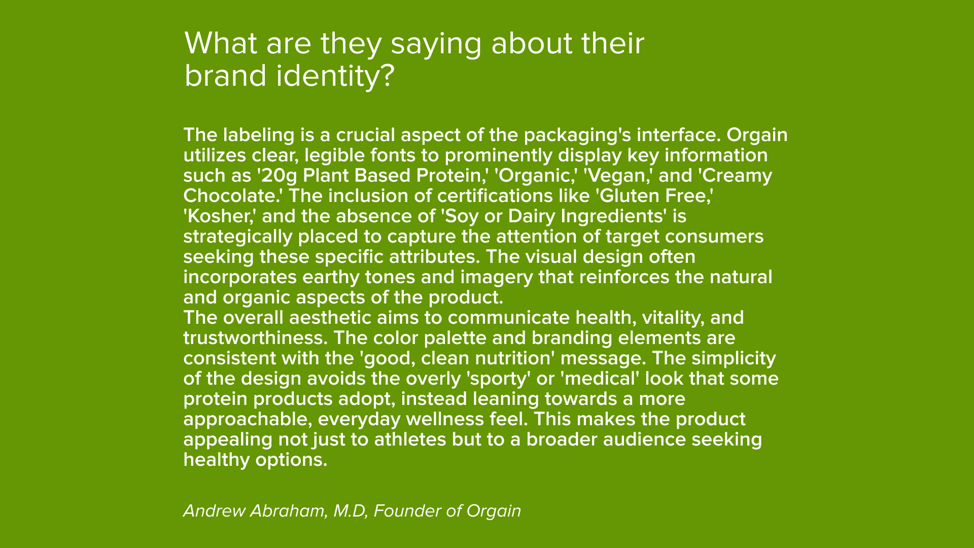
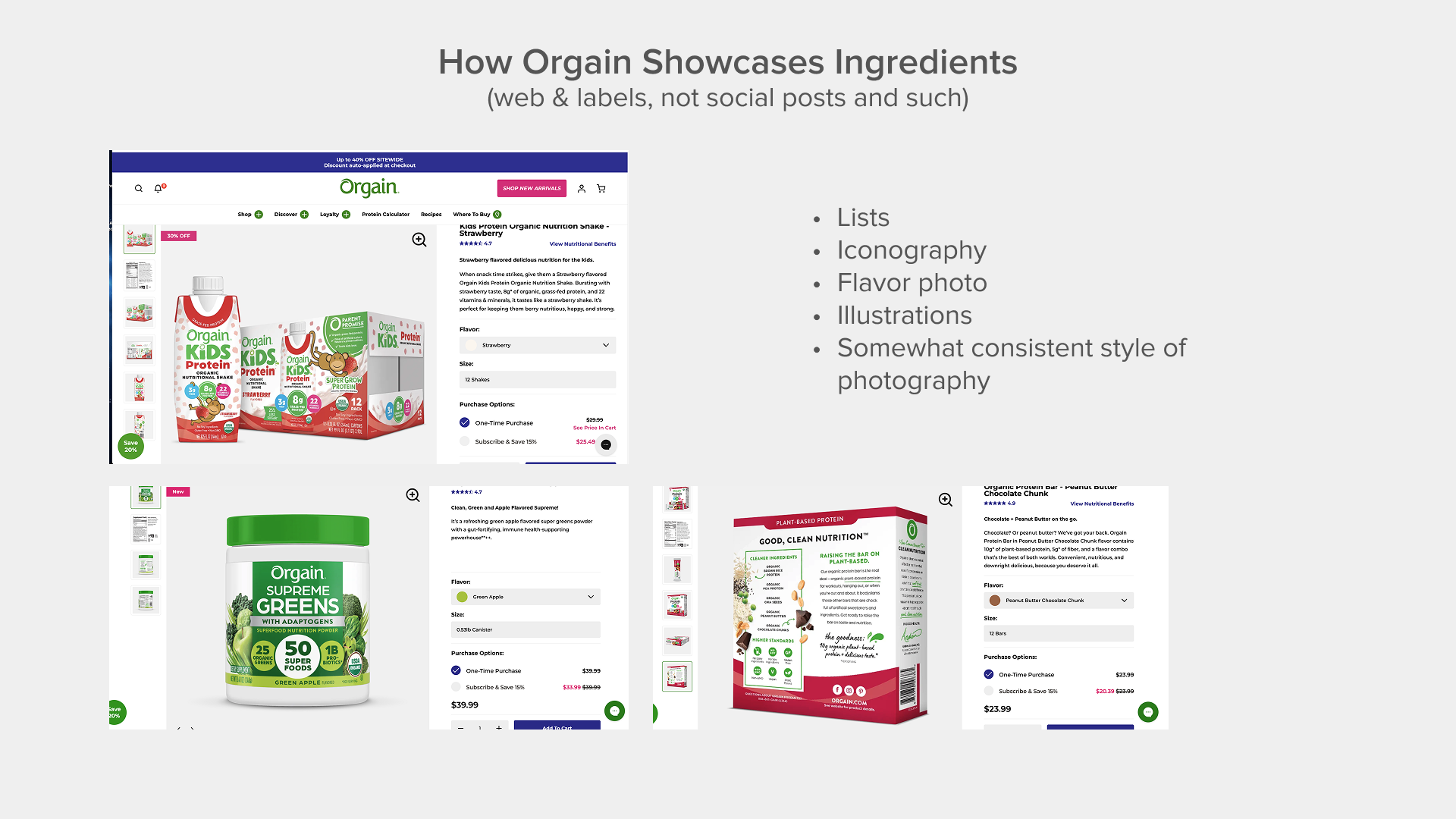
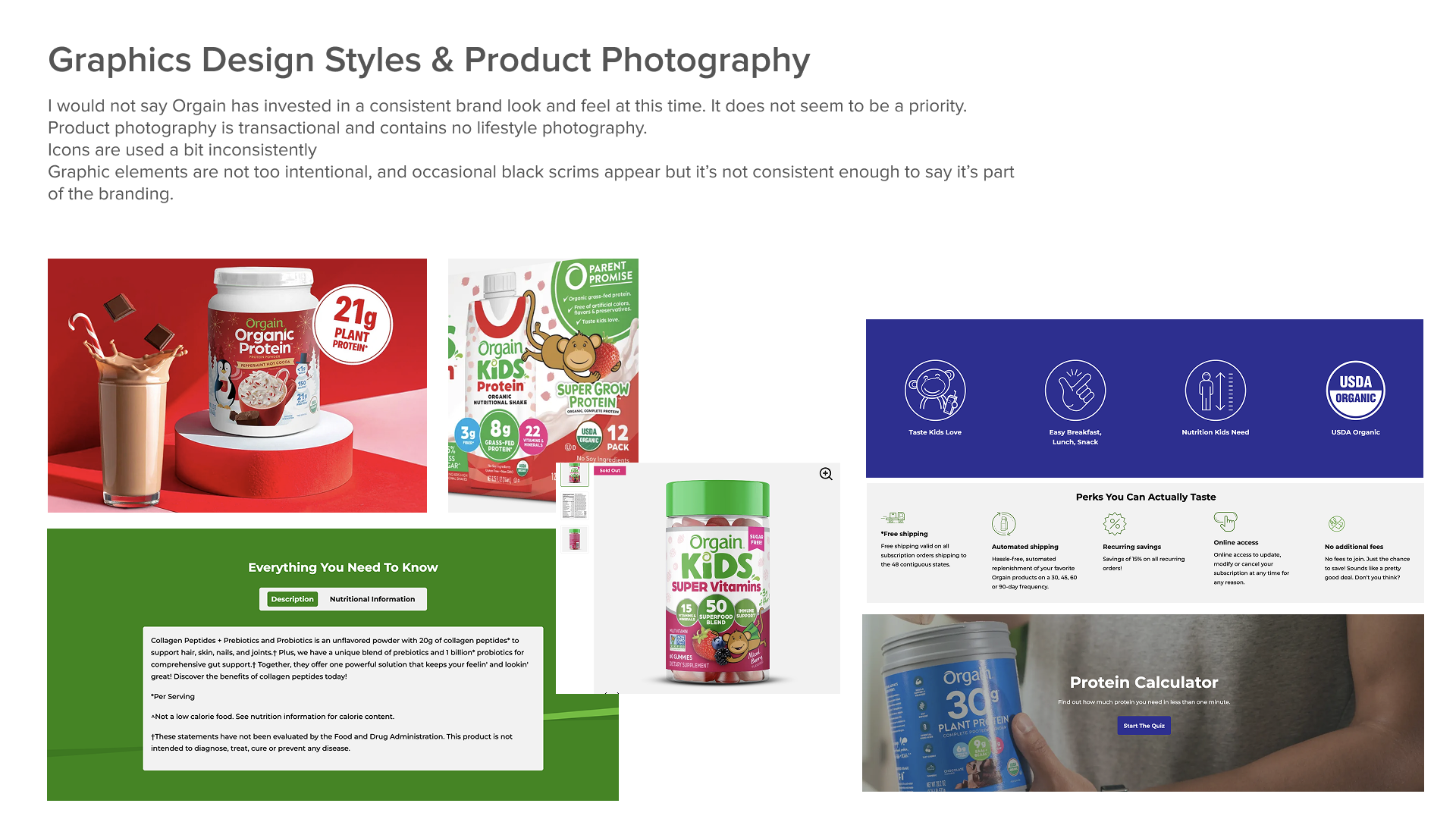
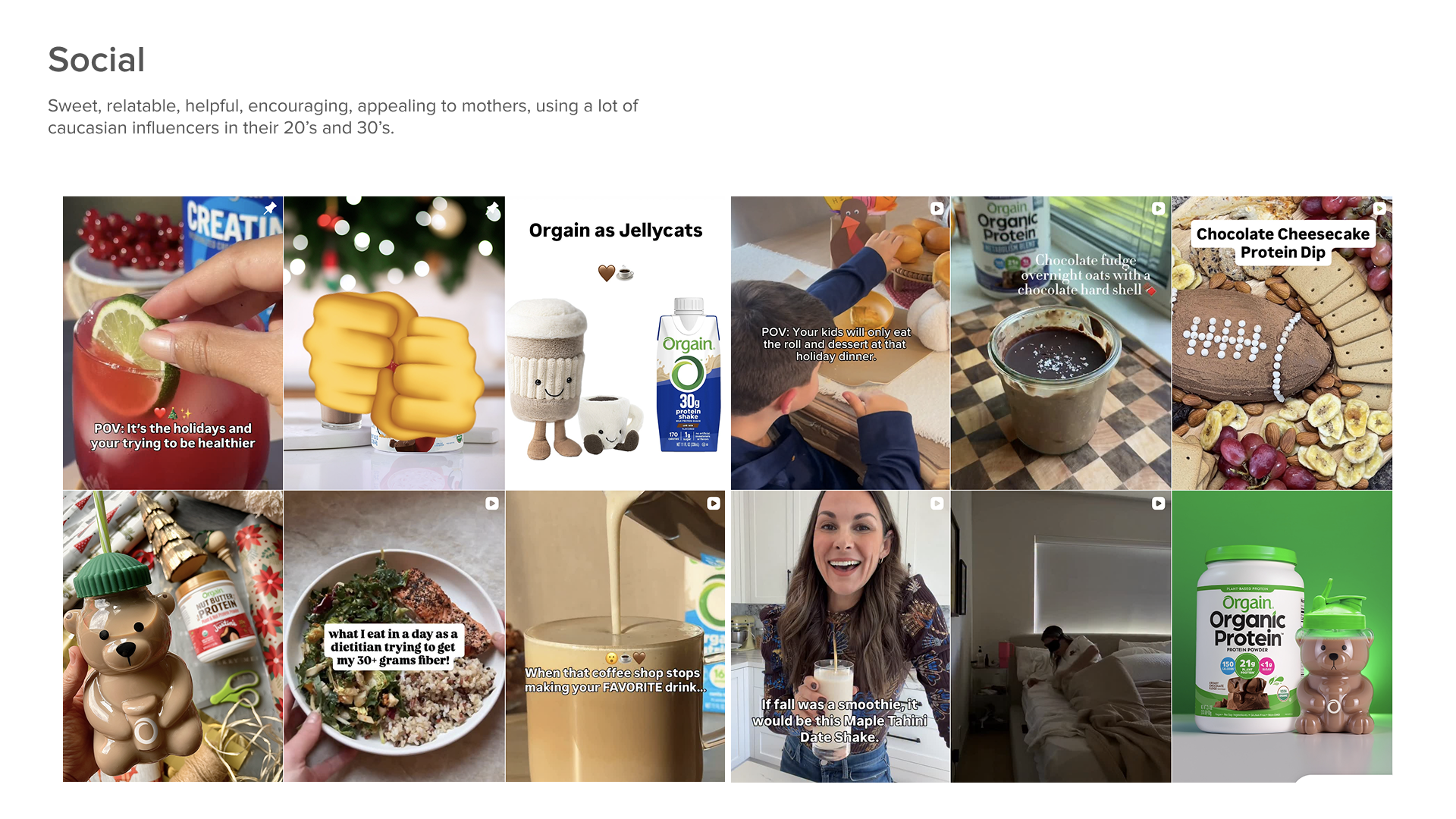
Orgain

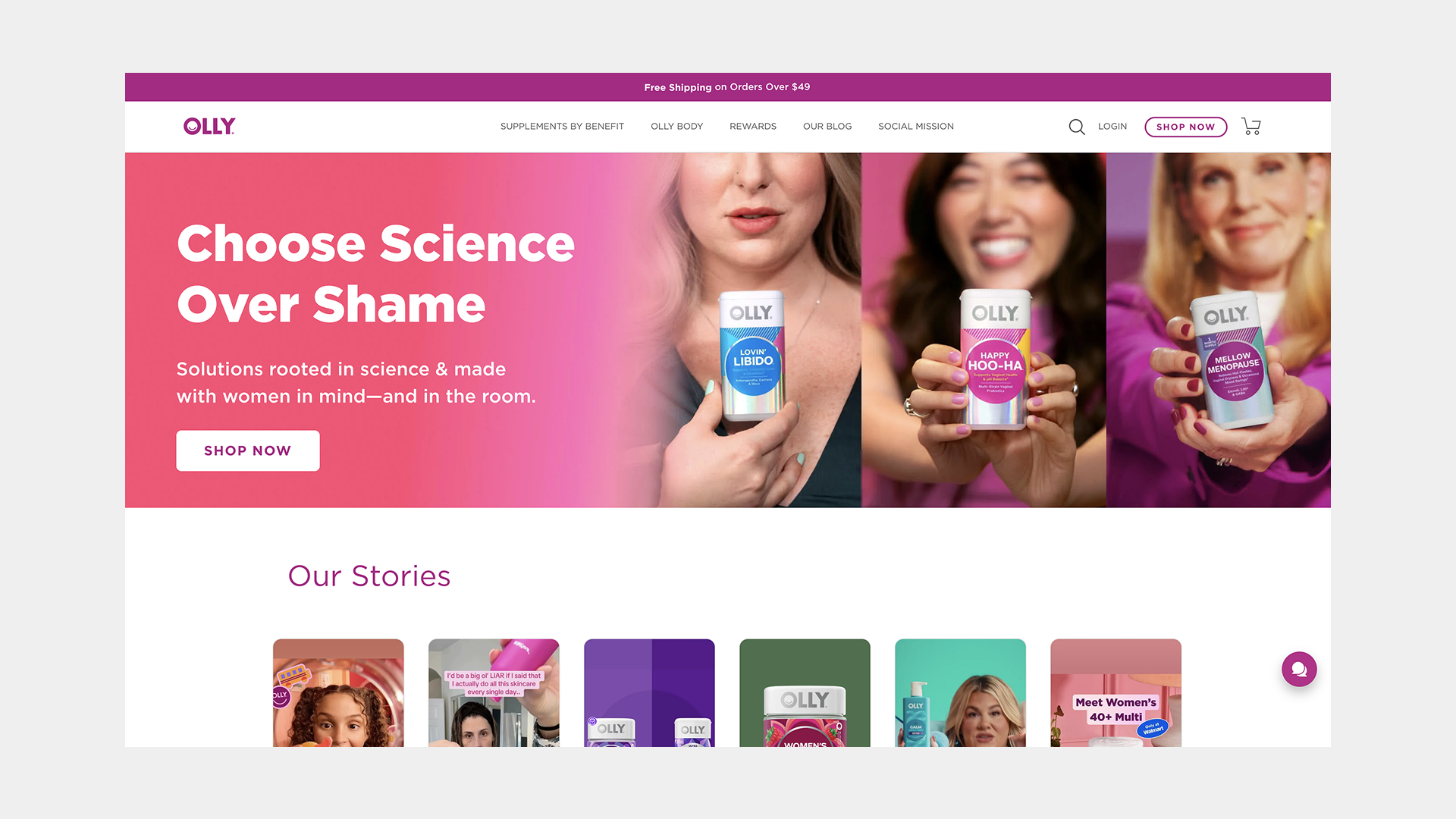
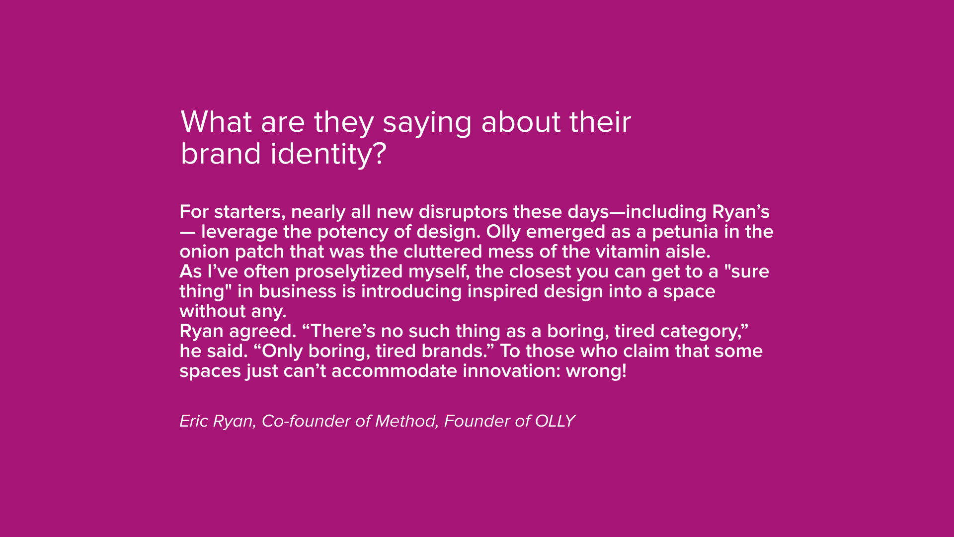
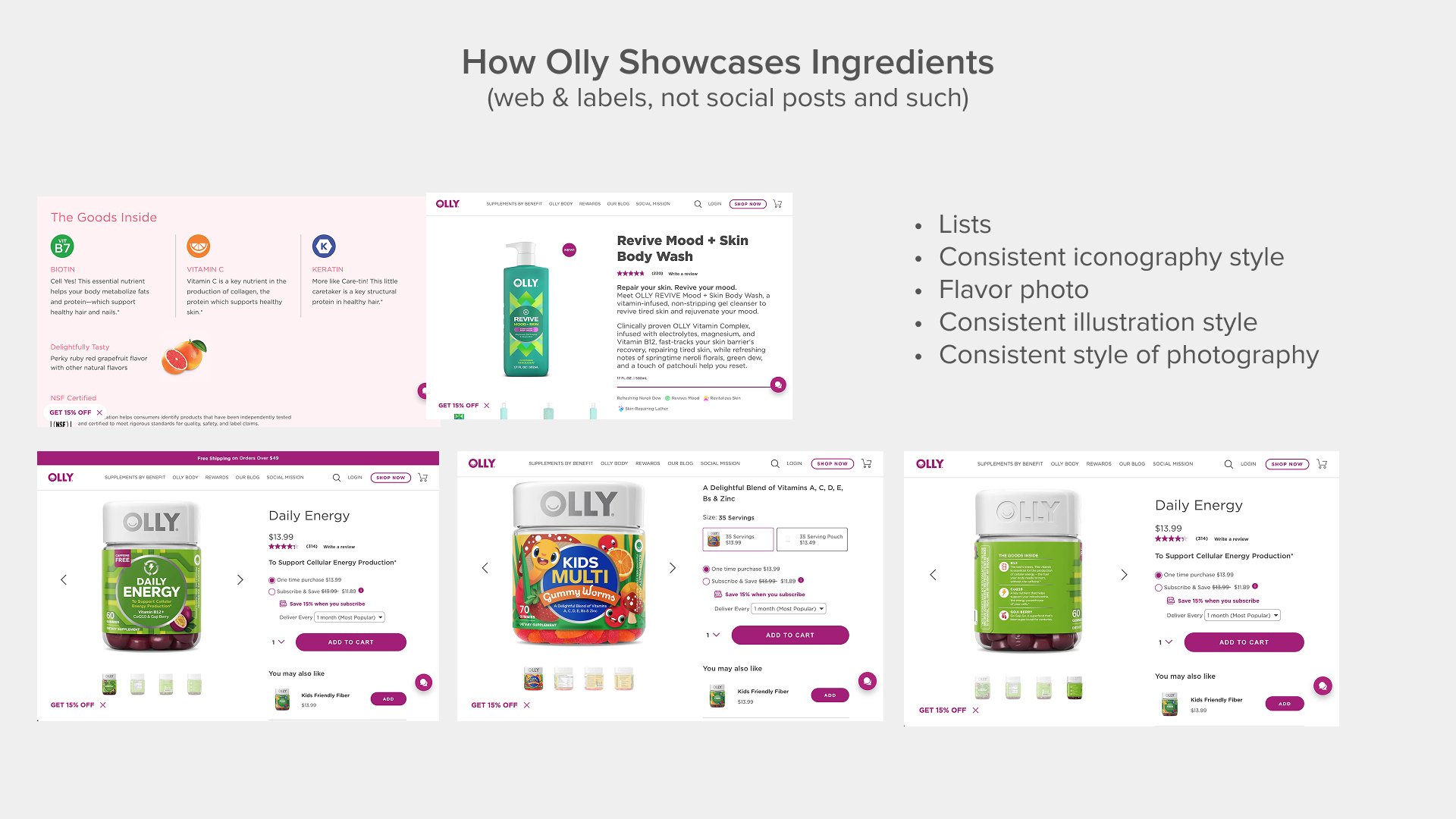
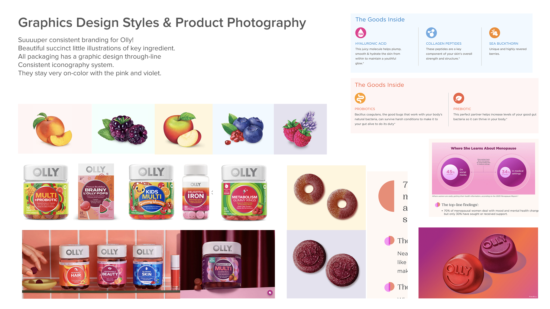
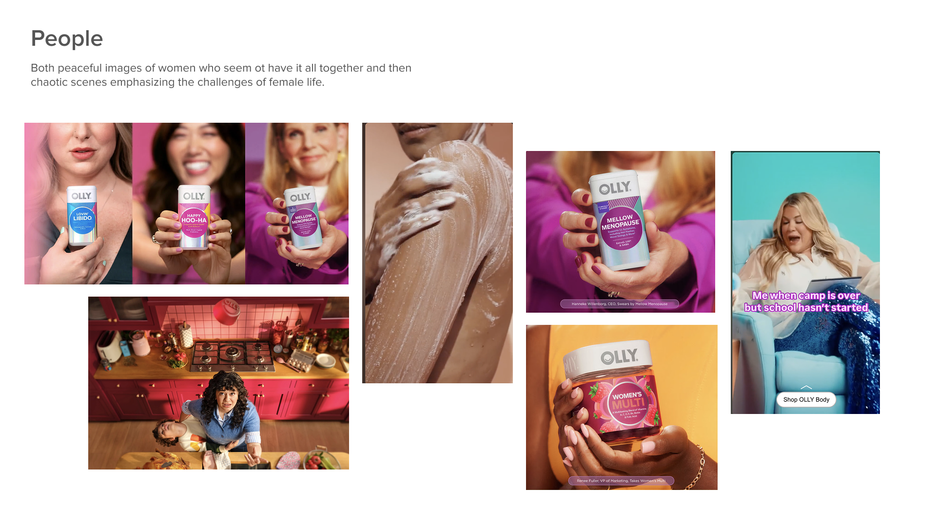
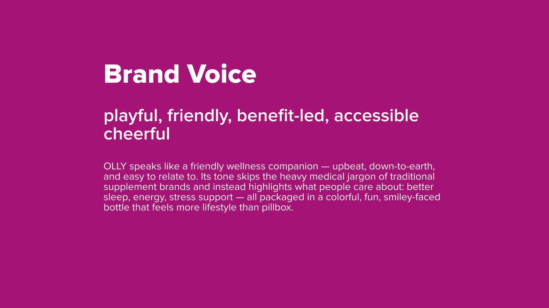
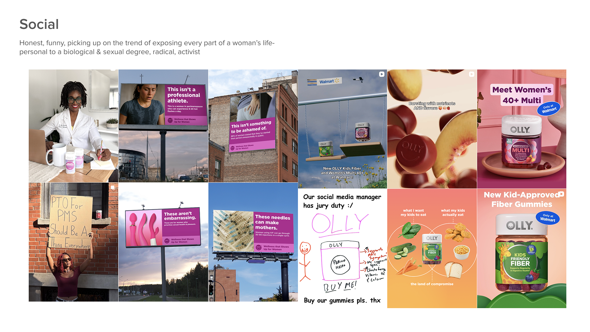
Olly
Kate Farms Insights
I promised some things we could do at the end here, but of course all subject to your vision for Kate Farms as well:
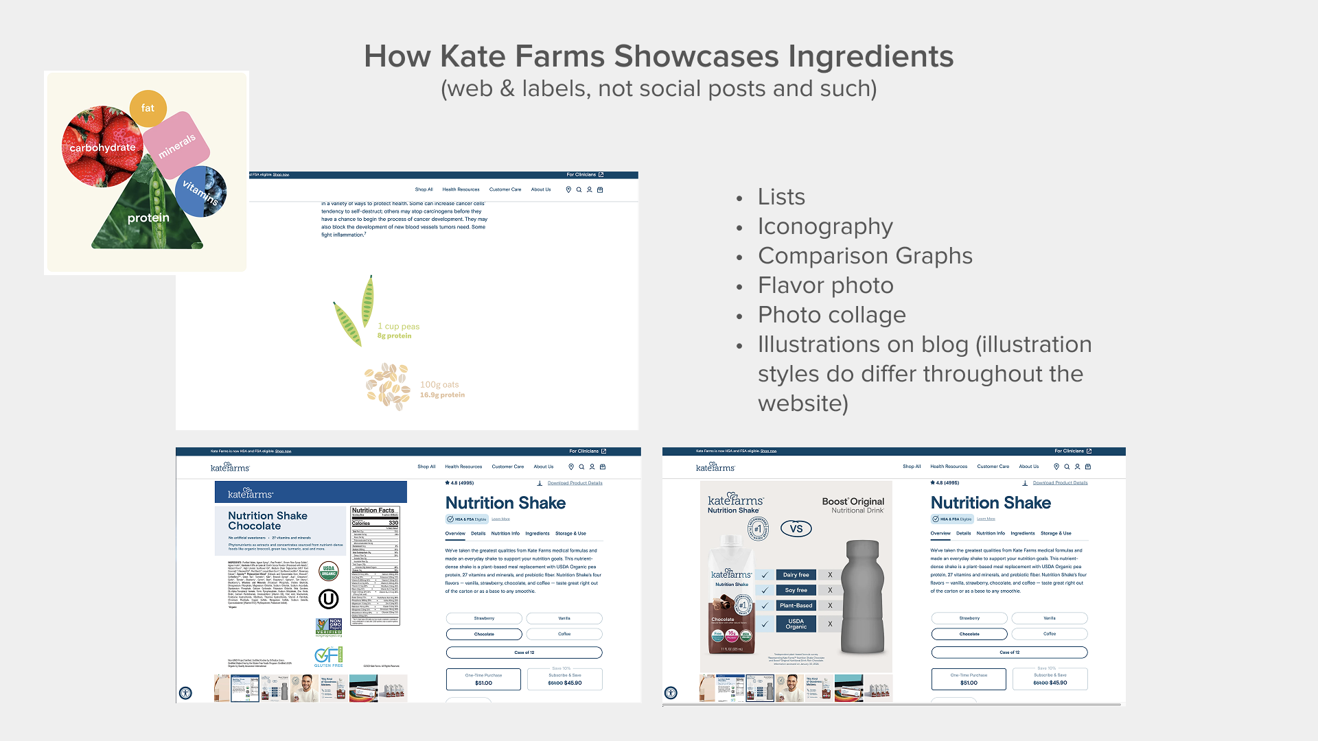
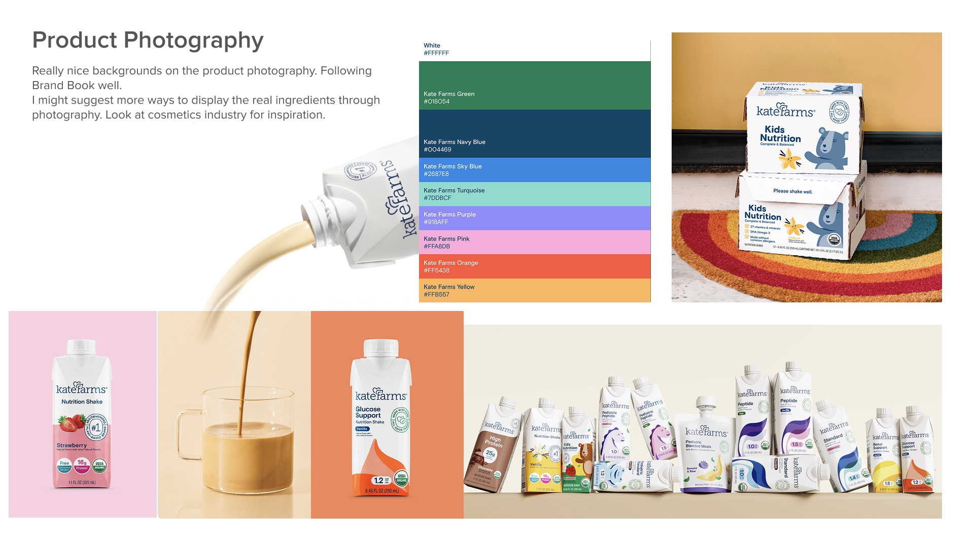
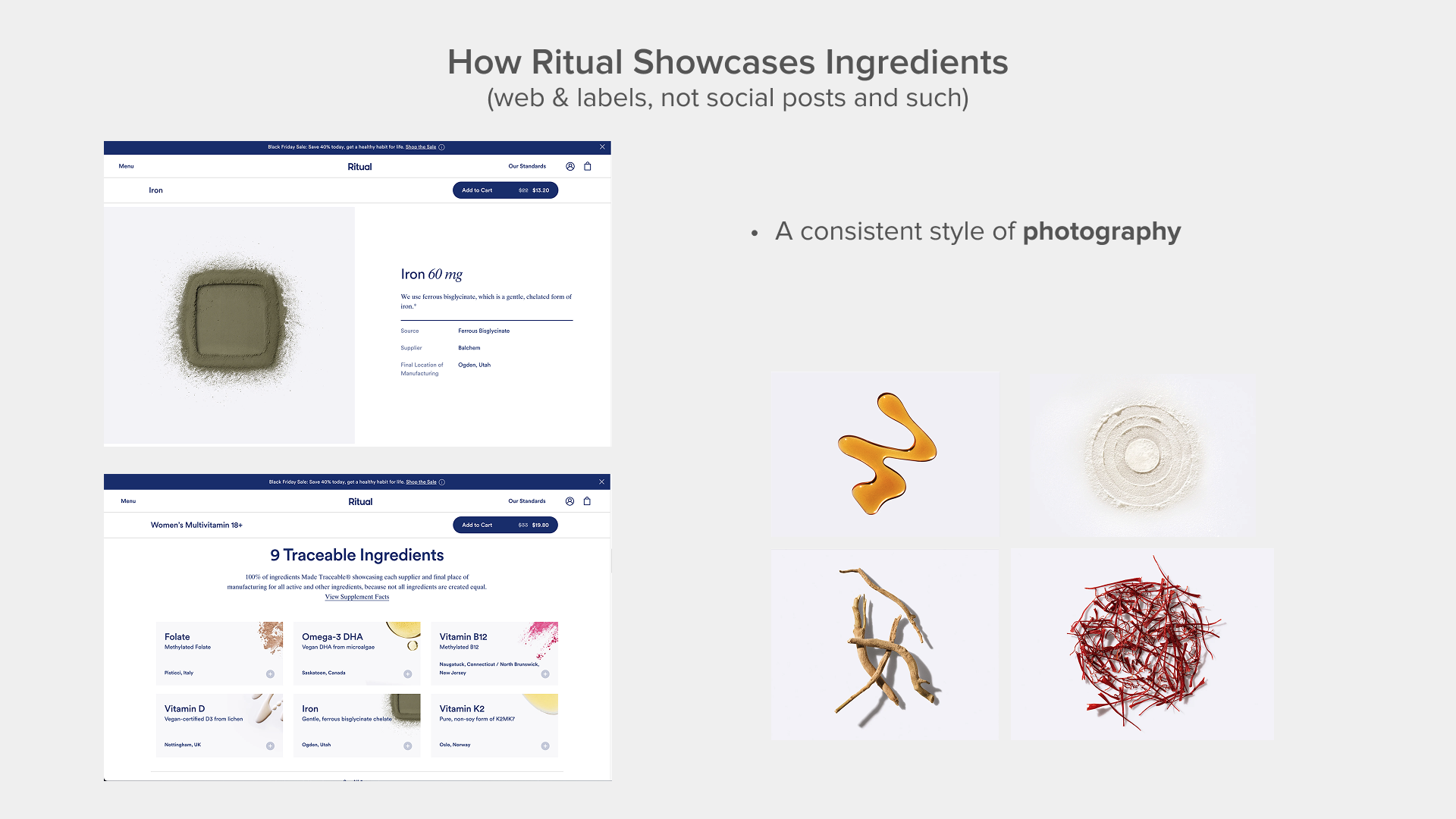
Ingredients- I think we could do a better job of showcasing the pure ingredients in a realer way. Current branding is illustration focused, but credibility of real nutrition sources works better in photography. Showing off ingredients in visual creative ways is working very well for Ritual.
Characters- Depending on how much of the future will be dedicated to children’s nutrition, I think we can push this much further with more detail to the characters and animation.
Typography- Typography goes a long way in forming a memorable snapshot of the brand. Right now the website and social are using a basic sans-serif font for everything. We could play a bit more here especially considering Kate Farms is creating many products for kids.
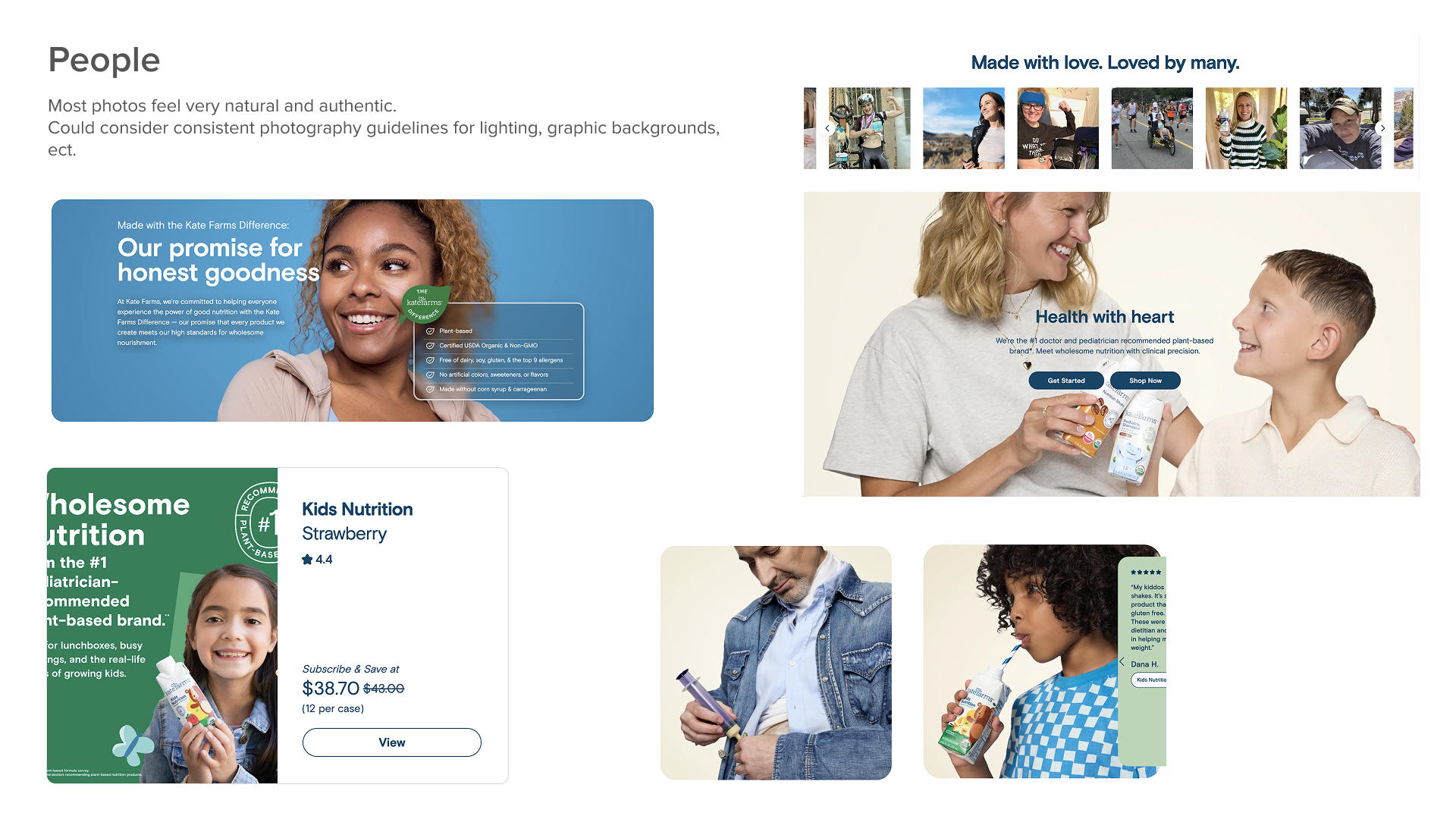
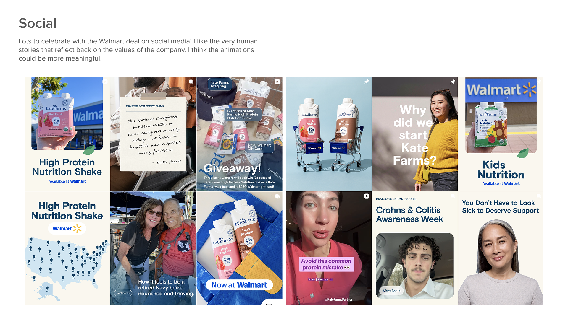
Lifestyle photography- We could do more photos in context and not rely as much on static images of people holding the products.
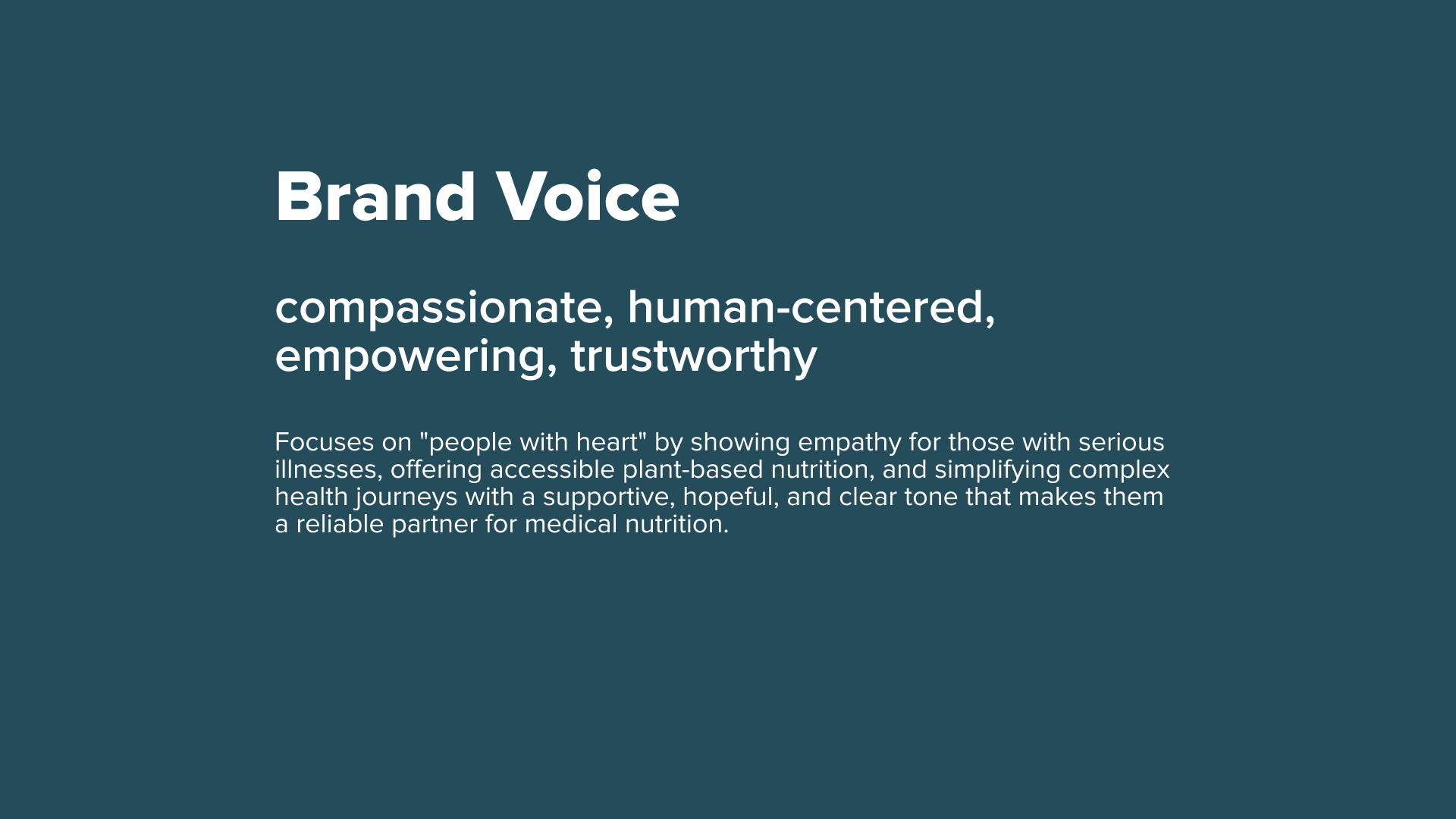
Voice- We could find a unique voice and match that with the adjacent photography in a more cohesive way. Maybe it centers around “farms.” I notice the brand does not emphasize farms in the copywriting very often. I notice Health with Heart is not paired with copy that speaks to the “heart” aspect of the header.
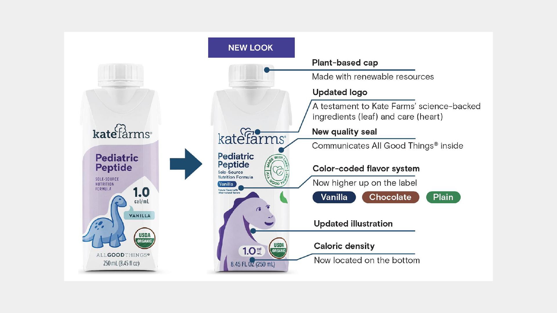
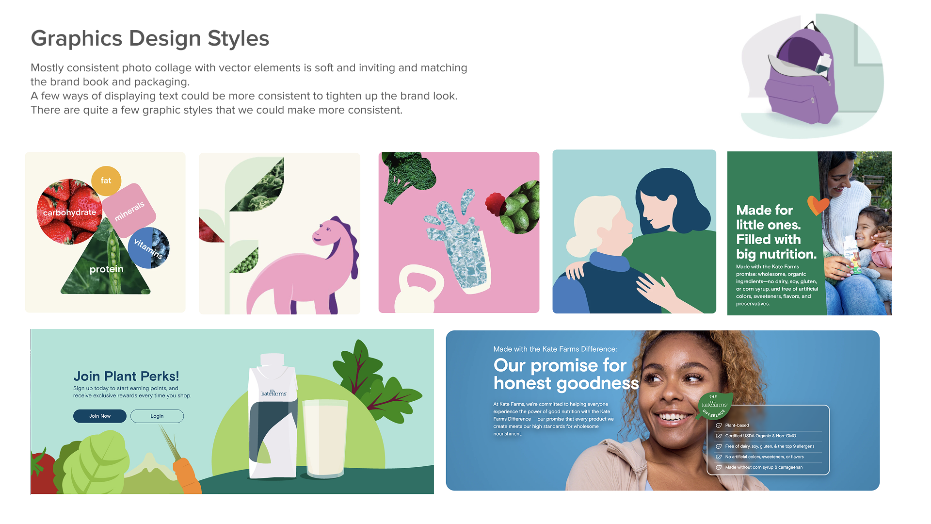
Graphic Design- In general the style can be made more cohesive and then rolled out to high priority areas first.